SSLN


Do Artifacts Have Politics? - Langdon Winner
In this extract, Langdon Winner attempts to politicise objects, which he defines as 'technologies'. He explores the relationship between humans and technologies and exemplifies how politics is, and can be, injected into them. 'What matters is not the technology itself, but the social or economic system in which it is embedded. This can be called the social determination of technology.' Winner explains that, while technologies may not explicitly convey political messages, they all possess 'intended and unintended political motives'; for example, Robert Moses, the man in charge of designing many of Long Island's overpasses, deliberately designed them so that buses, carrying lower/working class ethnic people, would not be able to access the overpasses, therefore blocking them from accessing his widely acclaimed public park, Jones Beach, motivated by his social class bias and racial prejudice. These overpasses were designed with upper class and 'comfortable middle class' in mind, so that they could easily use them with their cars for recreational or commuting purposes. This is an example of an intended political motive. However an unintended political motive would be exemplified by, for instance, the fact that there is a lack of consideration for handicapped people within society and its infrastructure. This therefore unintentionally enforces a certain idea regarding handicapped people.
These technologies would not exist without humans, so while it is valid to say that technologies can't have politics, due to their lack of personification and understanding of the society in which they were created, they were created in response to society and its needs and therefore have a purpose, perhaps influenced by the political beliefs of its creator.
Key notes from the extract:
'From late Neolithic times in the near east, right down to our own day, two technologies have recurrently existed side by side; one authoritarian, the other democratic,the first system-centred, immensely powerful but inherently unstable, the other, man centred, relatively weak, but resourceful and durable.' - Lewis Mumford, Technology and Culture.
'The factory system, automobile, telephone, radio, television and the space program, and of course nuclear power itself, have all been described as democratising, liberating forces.'
'In a recent essay, The Republic of Technology, David Boorstin extolled television for 'its power to disband armies, to cashier presidents, to create a whole new democratic world - democratic in ways never before imagined, even in America.'
'The things we call 'technologies' are ways of building order in our world. Consciously or not, deliberately or not, societies choose structures for technologies that influence how people are going to work, communicate, travel, consume and so forth over a long period of time. In the process by which structuring decisions are made, different people are differently situated and possess unequal degrees of power as well unequal levels of awareness.'
Initial Archive Research Idea:
An archive that would interest me a lot and that I would love to research is one that concerns itself with crime, but more specifically, murderers. I tried to find an archive online that might give me some direction as to where to go and where to look, however I had no luck as the majority of crime archives seem to be confidential. Therefore, I started looking for something that would be more accessible:
http://www.vam.ac.uk/content/articles/i/interior-design-in-the-archives
The archive that interests me the most is the V&A's archive of Interior Design in their Archive of Art & Design. This is because, as an already creative person, set design is a field that heavily interests me and interior design overtly connects to set design. The archive explores over 200 years of interior design and the influences upon and within it. It uses the notebooks, ledgers and correspondence of the interior designers that are represented within the archive, in order to convey a wide array of information and represent the timeline of changes as accurately as possible. I feel that I would be able to create an art piece in response to this archive that I would thoroughly enjoy every minute of.

Demel Mehmet - Making and Curating
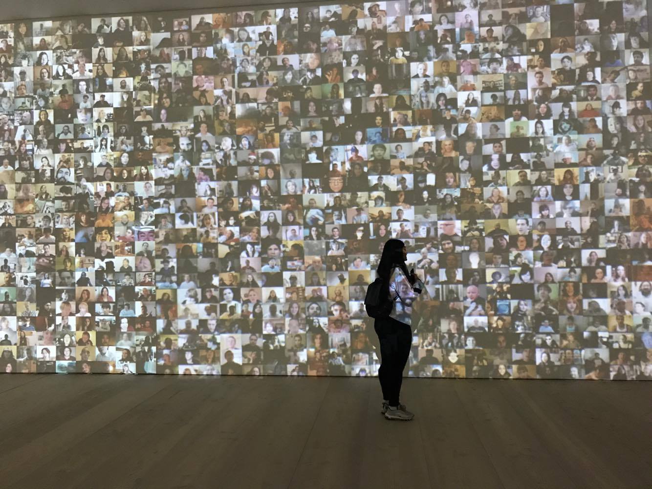
Selfie to Self-Expression - Saatchi Gallery
In the current state of modern society, it is hard to avoid the infamous selfie. With the uprise of social media taking over consumers' lives, the majority of civilisation relies on the selfie to portray certain messages and ideas about themselves. Often, selfies can launch a persons career or see them excel in their social media fame.
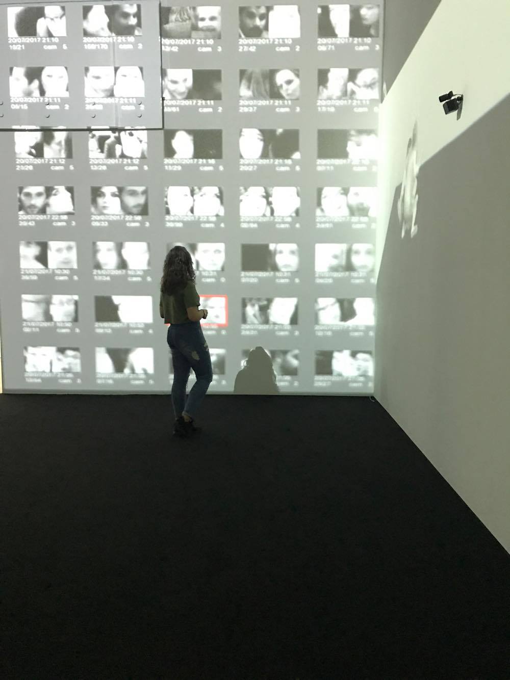
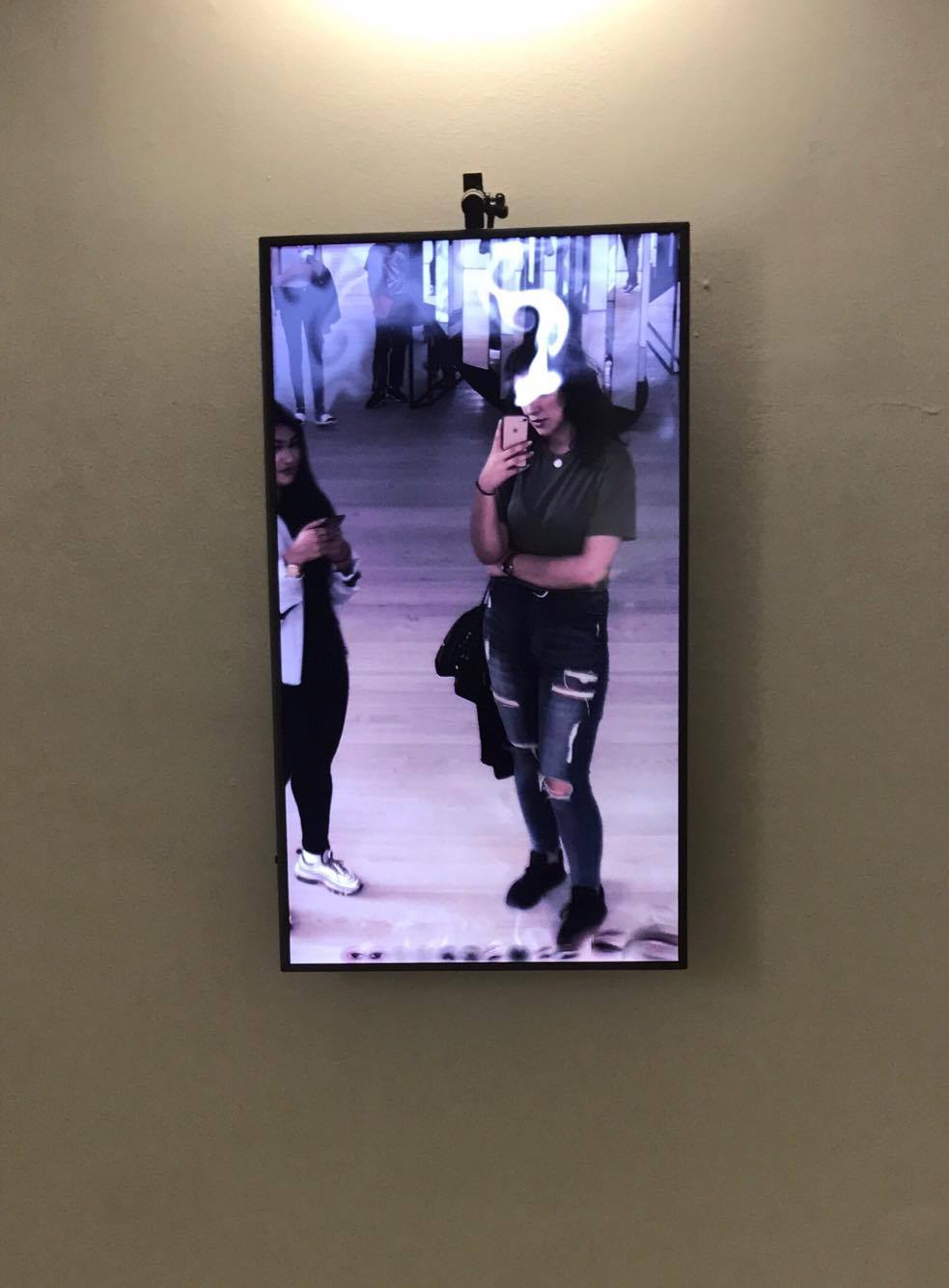
This exhibition at the Saatchi Gallery explores the growing importance of the selfie and all the identities that people can portray through it.
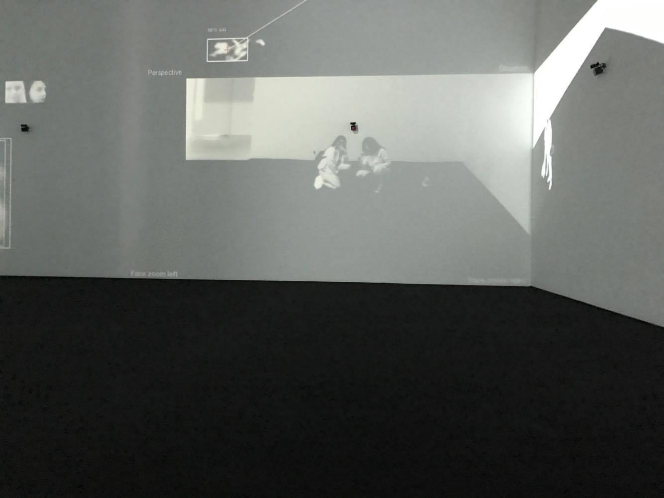
It began with a room full of phones connected to large screens displaying an Instagram-like app that allowed visitors to 'like' certain portrait paintings (the first selfies) from artists such as Rembrandt or Picasso, overtly exploring the juxtaposition of modern technology with past technology. The exhibition displays the journey that the selfie has taken from painted reflections to group selfies at the Oscar Awards, featuring some of the worlds richest stars. It even delves into the world of surveillance and how our selfies are being taken without our knowledge or consent. The exhibition provided visitors with many opportunities to be interactive and take their own selfies and explore different ways in which selfies can be taken; mirror reflections, augmented reality and even motion sensors.
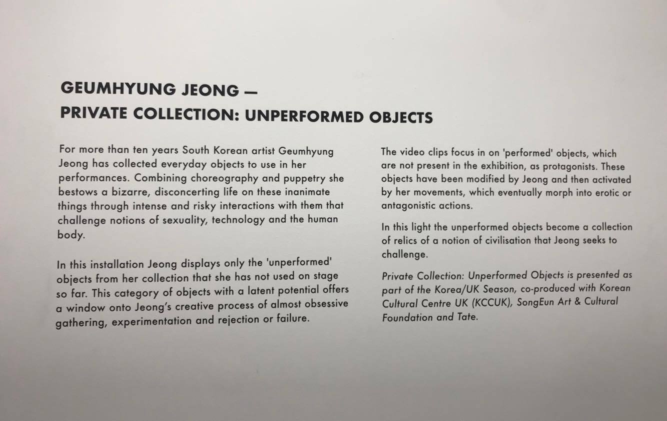
Geumhyung Jeong - Private Collection: Unperformed Objects 12/10/17
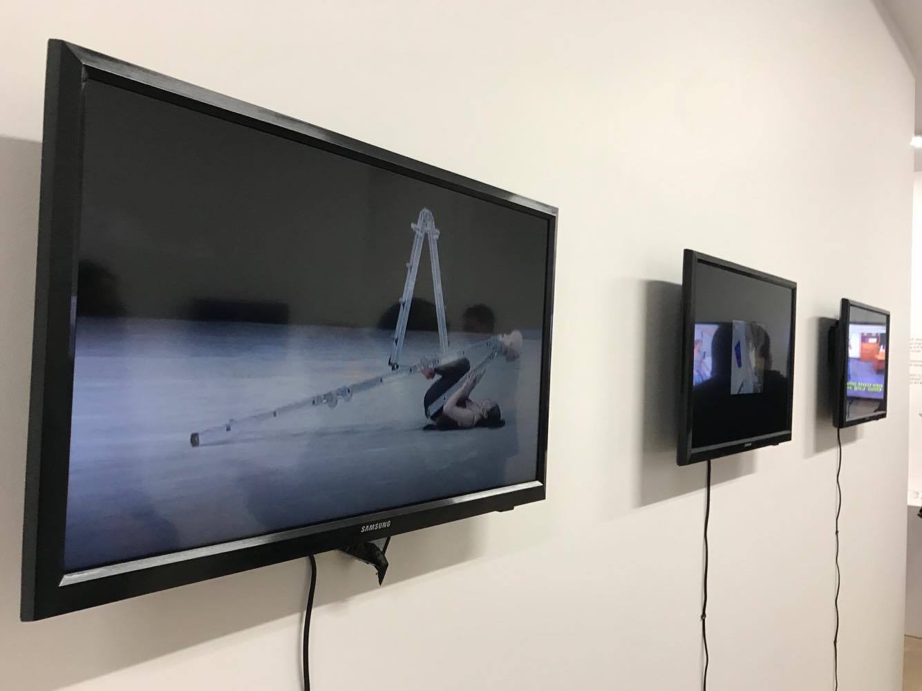
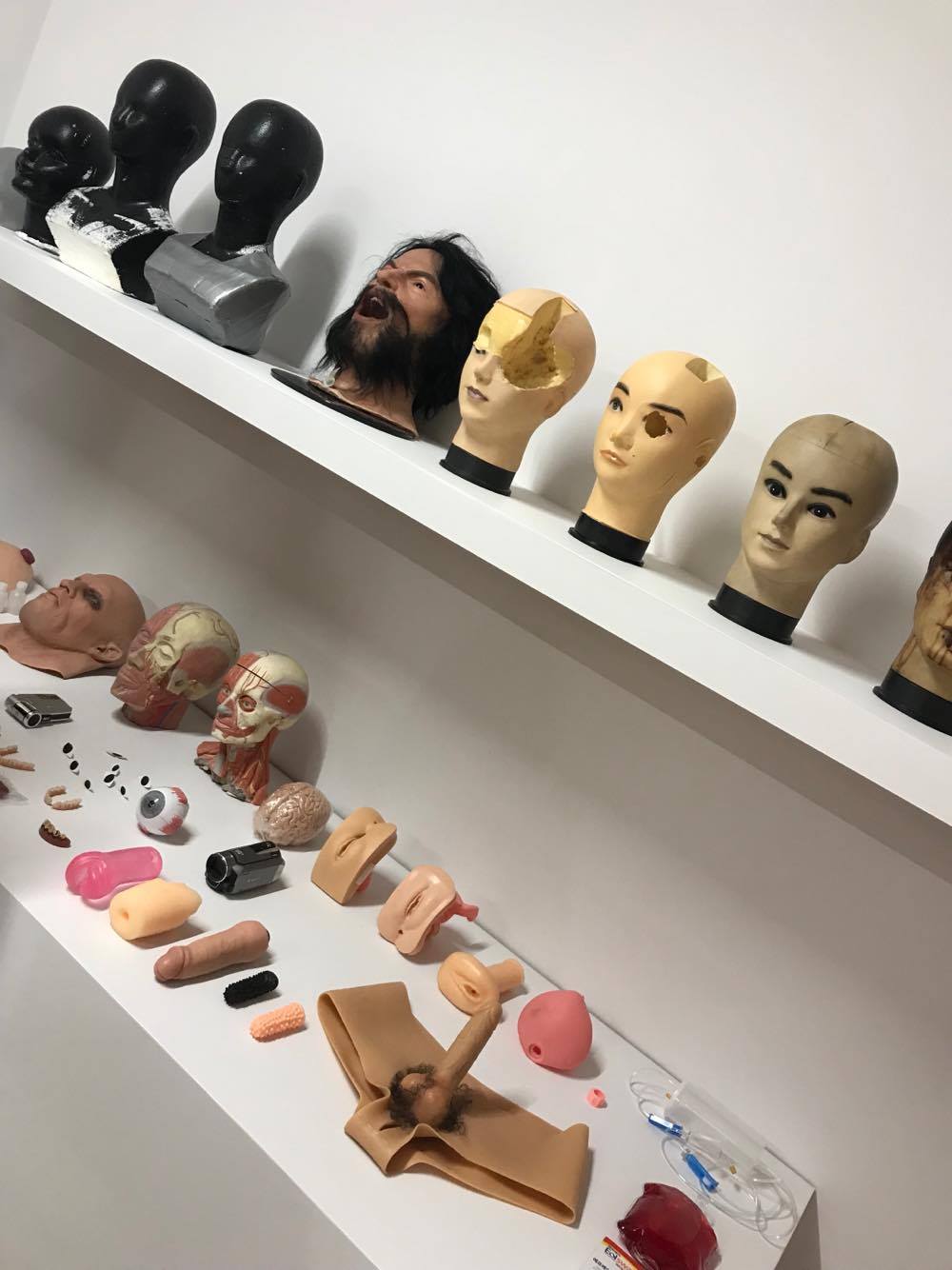
Geumhyung Jeong's exhibition of Unperformed Objects resides at the Delfina Foundation and explores
themes and objects that are considered taboo. Upon first glance, the viewer is taken aback as questions
fill their mind regarding the objects and videos on display, due to their explicit nature and adult themes.
In any society, it is odd to see a woman so open about sex and objects related to it, but British
civilisation especially, is not one to be so forthcoming about such themes and topics due to our
conservative mindsets and lifestyles,which is why I think the viewer is more shocked at what they are
witnessing.
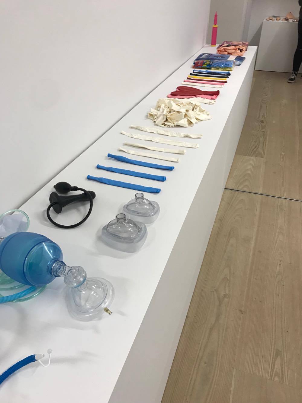
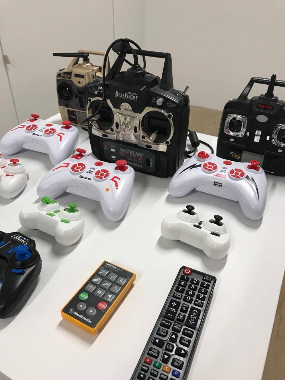
The exhibition raises a lot of questions about itself; why has the artist chosen this topic? What is the
connection between medical appliaces and sex? Why has she built robots to perform tasks that humans
were made to do? What is the purpose of making and curating these pieces and this exhibition?
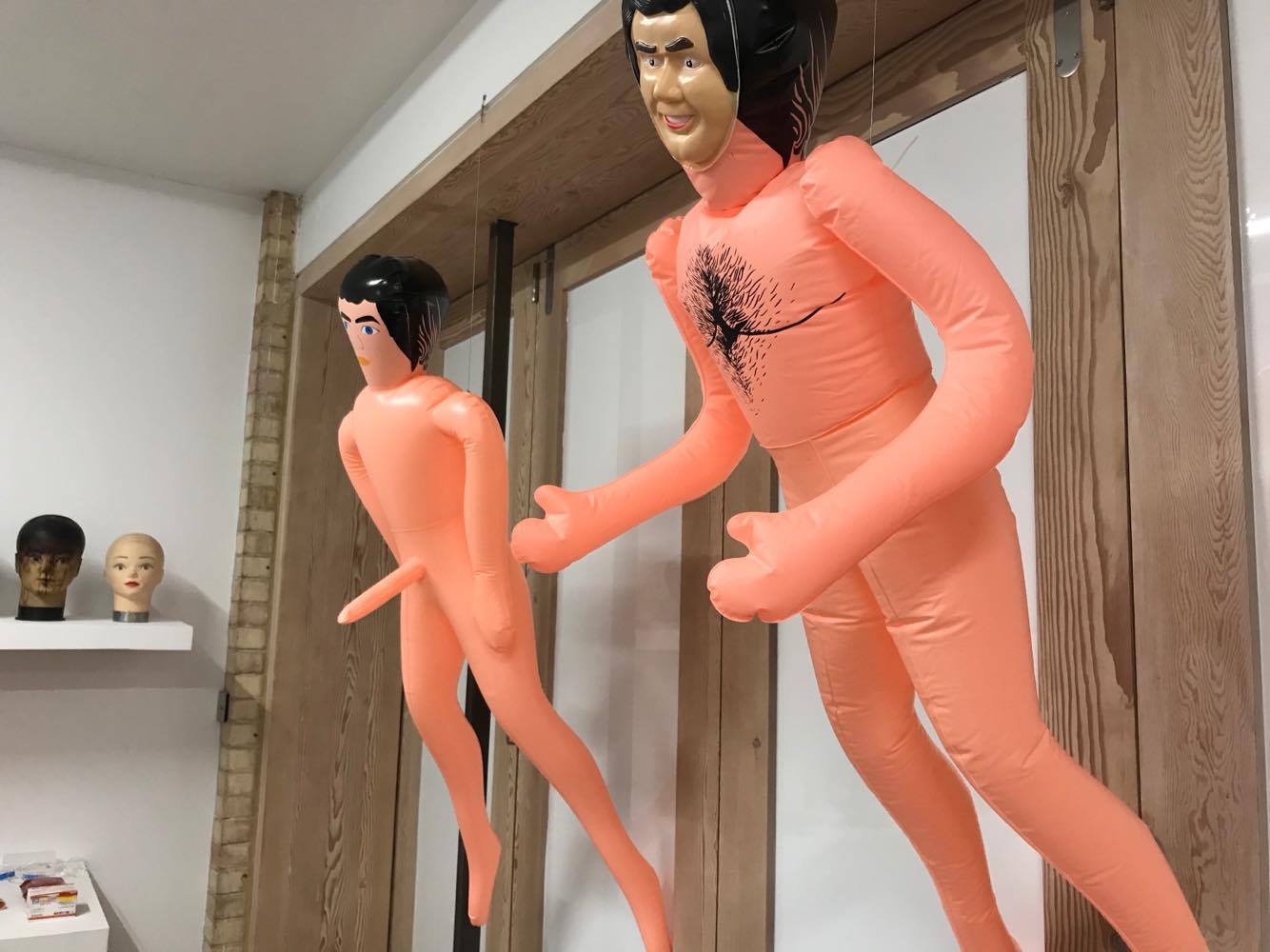
The exhibition can be seen in many ways; one way in which I picked up on, is the idea that Jeong is
objectifying and sexualizing men in the same ways that women are objectified and sexualized. She
stripped men of their human qualities and made them into robots that are only needed for one thing:
sexual acts. She used the robots the dehumanize and emasculate men to make them seem like they're
only good for one thing. Essentially, Jeong is the puppetmaster in this exhibition of control. There is a somewhat ambiguous
aspect to this exhibition in terms of the relationship between sexuality and animation. While it may seem obvious as to how
us humans can animate objects to perform how we want, the artist alters the typical perception of how this is done; by building robots, rather than using human force and
action.
The presence of everyday and medical objects in the exbition can confuse some viewers but it depends on the mind of the viewer; a lot of
objects
become sexalized just by their interaction with humans. For example, in the context of the artwork, a robot has become sexualized just
because of
it's interaction with Geumhyung Jeong. Some of the objects featured could just be medical objects from one perspective, but another
perspective might only see a sexual purpose for such objects.
CPR -> kiss of life -> kissing -> sex.
The whole idea of 'unperformed objects is due to the fact that some of the objects ondisplay have faced no manipulation, no human interaction and no
participatory interaction.
Stuart Hall Library visit 19/10/17
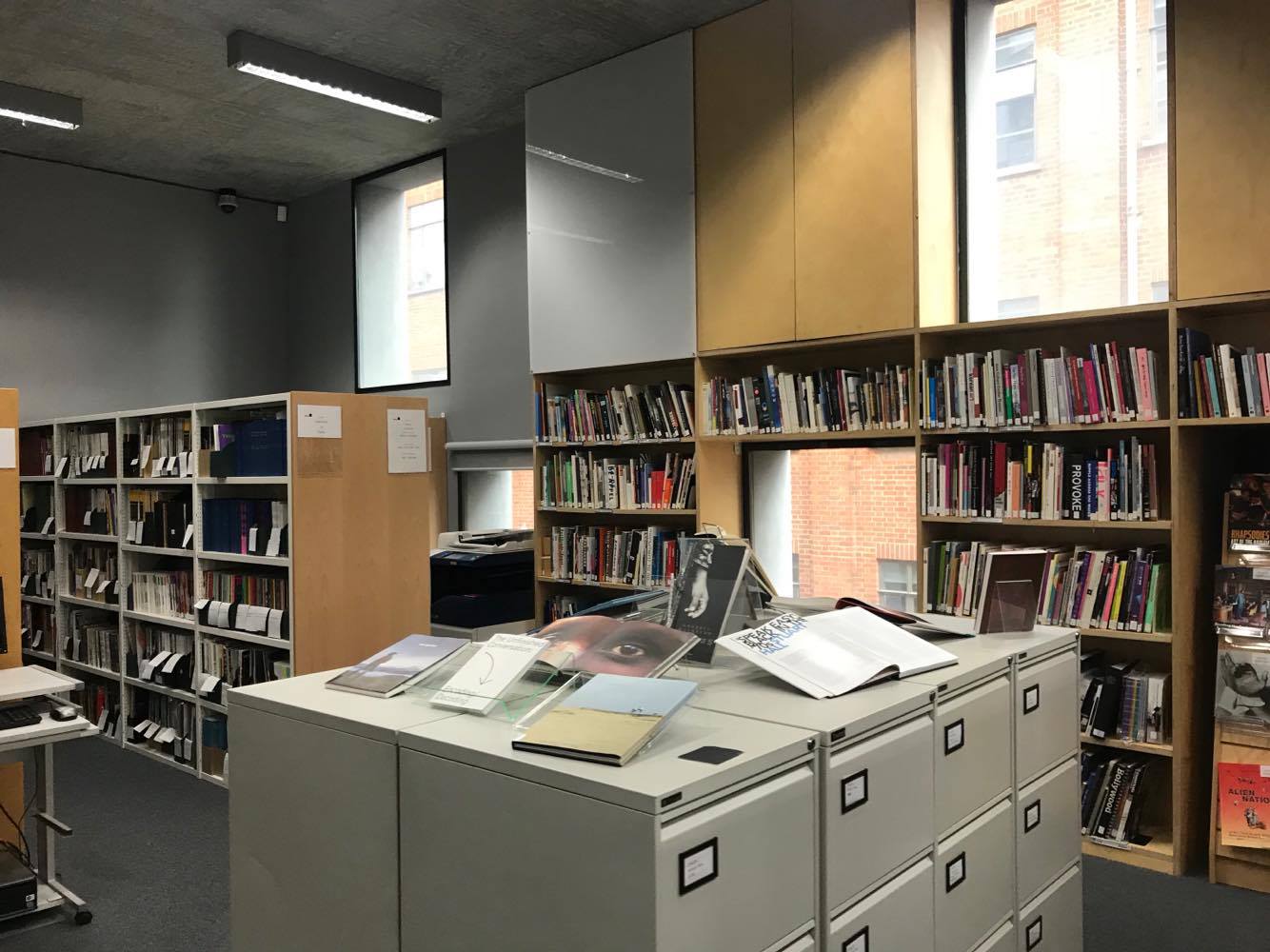
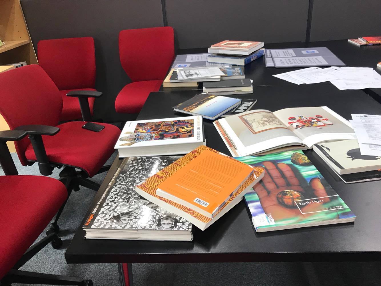
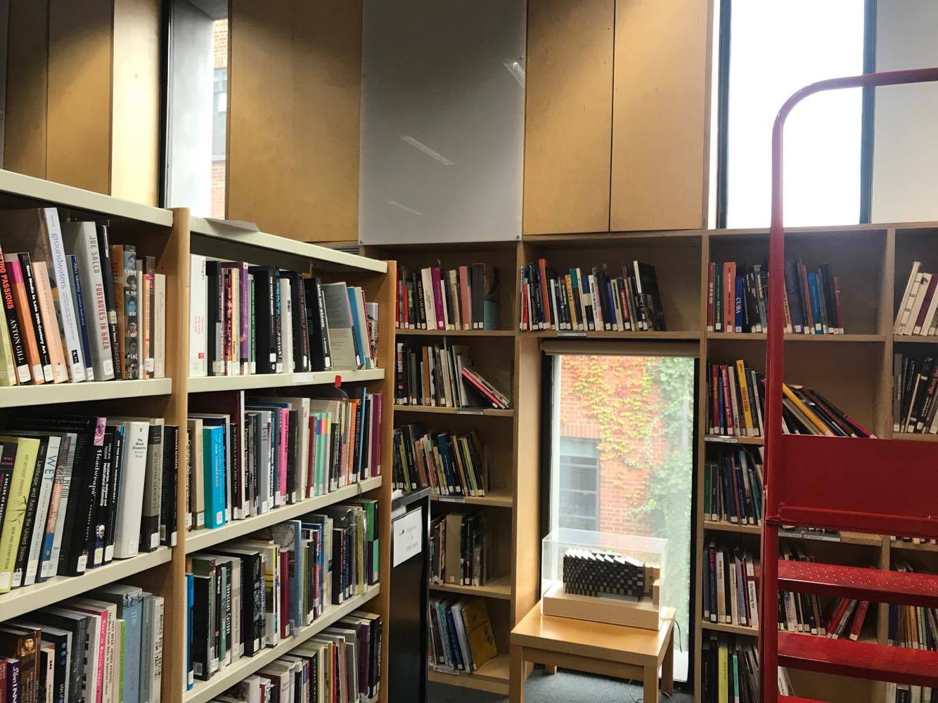
The Stuart Hall Library is an archive of works by various different authors and artists, covering
all topics imaginable, from historical recollections of events, to sex. The organisation and
categorisation of the library is rather interesting as it isn’t just one method of categorisation;
the outside walls are categorised by countries and continents, whereas the inner aisles are
categorised alphabetically. I was especially interested in the Middle Eastern section of the
library, as I am a Turkish Cypriot and I am interested in my culture. There were plenty of books
from and regarding Turkey, but I was disappointed at the lack of works regarding North Cyprus.
However, I still took pride in the Turkish section and read some of the books that it had to
offer. There was one particular book that took my interest; Visions of the Ottoman Empire
(Lawson. J, Stevenson. S, Henisch. H, Henisch. B. 1994). Personally, it took my interest
because it is something that I have always been intrigued in, but never had the time to fully
research. My grandad is also very knowledgeable on the topic and often talks about the Empire
and its breakdown, so it is natural for me to hear about the timeline of events and it gave me a
talking point with him. Not only does the book go in depth into Ottoman Empire, but it shares
paintings and other artworks from the era as well; taken from the blurb of the book:
‘Romantics of the nineteenth century like Byron and Delacroix invented an Orient of the mind
which was filled with drama and exotic colour. Travellers and scholars found equal fascination in the
reality and opened the eyes of the West to the complexity and richness of the countries and
peoples of the Ottoman Empire. Painters who visited the Near East, such as Sir David Wilkie,
David Roberts, John Frederick Lewis and William Holman Hunt explored the visual range of that
complexity.’ This book interested me so much that I have begun to consider changing my archive to the Ottoman era, however, I am still not 100% sure on what my archive will be.
The Power of Display: A History of Exhibition Installations at the Museum of Modern Art
- Mary Anne Staniszewski
This piece of writing discusses the history of the exhibition and the progression of
display methods used in order to communicate different things and provide different
meanings to exhibitions;
Installing paintings at approximately eye level on neutral wall surfaces in spacious
arrangements became a common practise during the 1930s and has reigned through
to modern day. Alfred J Barr stated that "an exhibition should elucidate as well as give
aesthetic pleasure." In other words, the exhibition should provide a clear picture of the
topic being portrayed, as well as looking nice. While using neutral wall surfaces, in
1933, Philip Johnson said that you should "never never use white for painting. Then
your frame is much brighter than your picture...If the area around the painting is
brighter than the painting then you're taking away from the painting."
The reception of art occurs within an ever-changing interaction between the viewer and
the artwork, meaning that the viewer's interpretation of the artwork is tailored and
influenced according to the state of the modern world. "The traditional art object, be it
a painting, a sculpture, or a piece of architecture, is no longer seen as an isolated
entity but must be considered within the context of this expanding environment. The
environment becomes equally as important as the object." - Frederick Kiesler
Mapping International Exhibitions - Bruce W Ferguson, Reesa Greenberg and Sandy
Nairne
This article discusses the historical context of exhibition location and all the meanings
that location can imply; In 1979, John Tagg likened every exhibition to a map. That,
like a map, an exhibition 'defines and describes a certain terrain, marking out its
salient features and significant points, omitting and simplifying others, but it also
depicts the ground according to a method of projection: a set of conventions and rules
under which the map is constructed." However, he recognised a problem being that in
seeing exhibitions as maps, the common nature of the representation tends to be
hidden in use. "The laws of projection become invisible." While there is this problem
that Tagg identified, Kenneth Luckhurst stated that "the exhibition is a tool of a
thousand-and-one purposes, and half of them have not yet been discovered."
'There is a long history of international exhibitions which encompass three interrelated
parts: the promotion of art in support of cultural and national identity; the growing
development of commercial world traffic in art; and an expansion of the modernist
doctrine in which art is a 'universal' language as well as an instrument of exchange.
This 'unconscious' of modernist art - its own universalist beliefs and claims - and the
deliberately hierarchic policies of dominant political forces have complicitly joined
together to anchor an era of cultural politics and political cultures in which modern art
often acts as logo for the enterprises of Western governments and capital.'
Stephen D Levine questions whether an exhibition can contain more than one voice or
can a voice exhibit more than one message?
It is also noted that just because questions of identity or cultural diversity are
central to contemporary art, culture and politics does not mean that their exposure
is guaranteed nor considered to be of importance to traditional exhibition practises
and practitioners.
Thinking Contemporary Curating: What is Contemporary Curatorial Thought? - Terry Smith
This chapter attempts to explore and discuss the context surrounding curation, in terms of idea creation, exhibition and meaning. Smith states that place making, world picturing, and connectivity are the most common concerns of artists these days because they are the substance of contemporary being. The first step is to recognise that the object of contemporary curating is much greater than contemporary art. It must encompass all other art: art from any and every past, current art that is not contemporary, as well as projective, future art. Smith realises that contemporary curating does not follow a set of rules; rather, it adopts an approach spawned from an arising set of attitudes. 'To exhibit is to bring a selection of such existents, or newly created works of art, into a shared space with the aim of demonstrating, primarily through the experimental accumulation of visual connections, a particular constellation of meaning that cannot be made known by any other means.'
Contemporary curating aims to display some aspect of the individual and collective experience of what it is, or was, or might be, to be contemporary. The exhibition setting is a selective offering of art to an audience, to arts future, and to the world to come. The curator is a crucial creator not necessarily to the creation of an artwork, but certainly to its becoming public beyond a narrow circle, to its entering art world, its reaching the expanding audiences for art, and thus its circulation to the world at large.
He also makes the point that installation is both presentation and
commentary, documentation and interpretation.
To Be Continued: Periodic Exhibitions (documenta, for example) - Walter Grasskamp
This text recalls Grasskamp's experience with documenta.
Documenta - an exhibition of contemporary art which takes place every five years in Kassel, Germany. It was founded by artist, teacher and curator Arnold Bode in 1955 as part of the Bundesgartenschau (Federal Horticultural Show) which took place in Kassel at that time, and was an attempt to bring Germany up to speed with modern art, both banishing and repressing the cultural darkness of Nazism.
Walter Grasskamp is a German art critic.
'Abstraction as a world language' - Documenta was initially really only for German art, however the second documenta tried to propose a recipe for Western art and convince Western people to get involved.
Periodic exhibitions have not only been the oldest, but the most successful model of art mediation. Their repetition gave them importance, attention and resonance.
Spaces of Experience - Charlotte Klonk
This extract regards the idea of the spectator as a consumer, as society has become accustomed to a world of shopping. Consumers don't look to find meaning, they look as if they would in a supermarket at different brands of food. Klonk discusses the importance of methods of display and how it affects consumption. The relationship, similarities and fine line between spectator and consumer is the main crux of this extract, exploring the ways in which a simple viewer, can become the complex consumer.
'For Walter Benjamin, phantasmagoric (having a fantastic or deceptive appearance) experience is characteristic of a culture dominated by mass consumption; it is a form of experience that, while it promises fulfilment, remains essentially empty.'
SPECTATOR//CONSUMER
'The white wall and flexible ground plan with removable partitions had become a dominant mode of display after the Second World War in commercial spaces as well as in museums.'
'Warhol showed his screen prints like artworks on the white walls of the museum - at eye level and with sufficient distance between them so that none could be seen as having greater value than another. Yet by placing them on a shelf and exploiting the similarity of the images themselves, what Warhol evoked was not so much the aesthetic contemplation of unique objects as the multiple choice dilemma of a consumer facing products on the shelves of a store. The message that Warhol conveyed to his audience was that the experience to be had in an art gallery was no more meaningful than that in a supermarket.'
'If anything is to be found today, it is in those museums showing pre modern are that need not accommodate artist-created environments. Yet here a pseudo-historical ethos has come to dominate, far removed from past experiments with modes of viewing.'
'By the end of the 20th century, it had become as fashionable to evoke past styles in fashion-led interior design as it has been to be future-orientated in the 1950s.'
'The use of of a novel background colour promises a fresh experience of work that might otherwise appear dull by comparison with the vividness of contemporary art. Yet such colour choices are made with increasing frequency not by curators but by interior designers, who nowadays are very often employed in art galleries.'
'Such artist-determined spaces do not lead to new conceptions of gallery spectatorship as did the curator-created gallery interiors of the past. Each totally absorbing, they vie for attention with one another as they appear side by side in the museum - much like the different stores in a shopping mall. Despite the creator's intentions, they do not challenge established consumer modes of viewing.'
'One might be inclined to think that the identification of the gallery experience and shopping is merely an idea received from the kind of cultural criticism fashionable in the 1960s and 1970s, which saw the hegemony of the commodity in all aspects of capitalist culture. But there is more to it than that. As we have seen, market ideals and business interests played an enormous role in the development of the Museum of Modern Art's conception of art spectatorship, and the relationship only seems to have intensified in the gallery world after the Second World War.'
'Art galleries, however, have not explicitly embraced the parallel with commercial display in the way that they organise their collections. The consumer-spectator is the last thing that curators in modern art galleries would now say that they want encourage...Yet it seems no coincidence that the model of the spectator as consumer appeared at exactly those points where historians identify the origins of modern consumer society. What characterised those societies was that consumption had moved beyond necessities towards lifestyle goods, and that large sections of society beyond the privileged upper and upper-middle classes could now find social definition through acts of buying. Luxury goods consumption became a common leisure activity. It is only natural that the museum should have sought ways to address this new, style-conscious consumer.'
'Perhaps the greatest innovation in art galleries has been the need to adapt to the emergence of new media such as film, videos, DVDs and the Internet.'
Modes of Presentation:
Creative response to my Stuart Hall Library blog post:
I chose to respond to my Stuart Hall Library post because I spoke about a book that interested me, called 'Visions of the Ottoman Empire'. The book explores the history of the Ottoman Empire, with an emphasis on art from that era. Therefore, I thought it would be relevant to copy a piece of art from the Ottoman Empire times and, having Google searched the topic, The Tughra of Suleiman The Magnificent came up so I drew it.
"The Ottoman Tughra is a calligraphic emblem of the Sultan's authority that was included in all official documents. Used by the first Ottoman sultan in 1324, it later developed into a more complex form that included three vertical shafts and two concentric oval loops on the left. It consists of the name of the reigning sultan, his father's name, his title, and the phrase 'the eternally victorious'. This unique calligraphic emblem was not easily read or copied. Therefore, a specific court artist was designated to draw the undecorated, standard tughra. A court illuminator assisted him in the exquisite decoration of the tughra on certain imperial documents. The illuminator's delicate scroll design and naturalistic flowers enhance the harmonious lines of calligraphy, creating a colourful voluminous effect." - Metropolitan Museum of Art
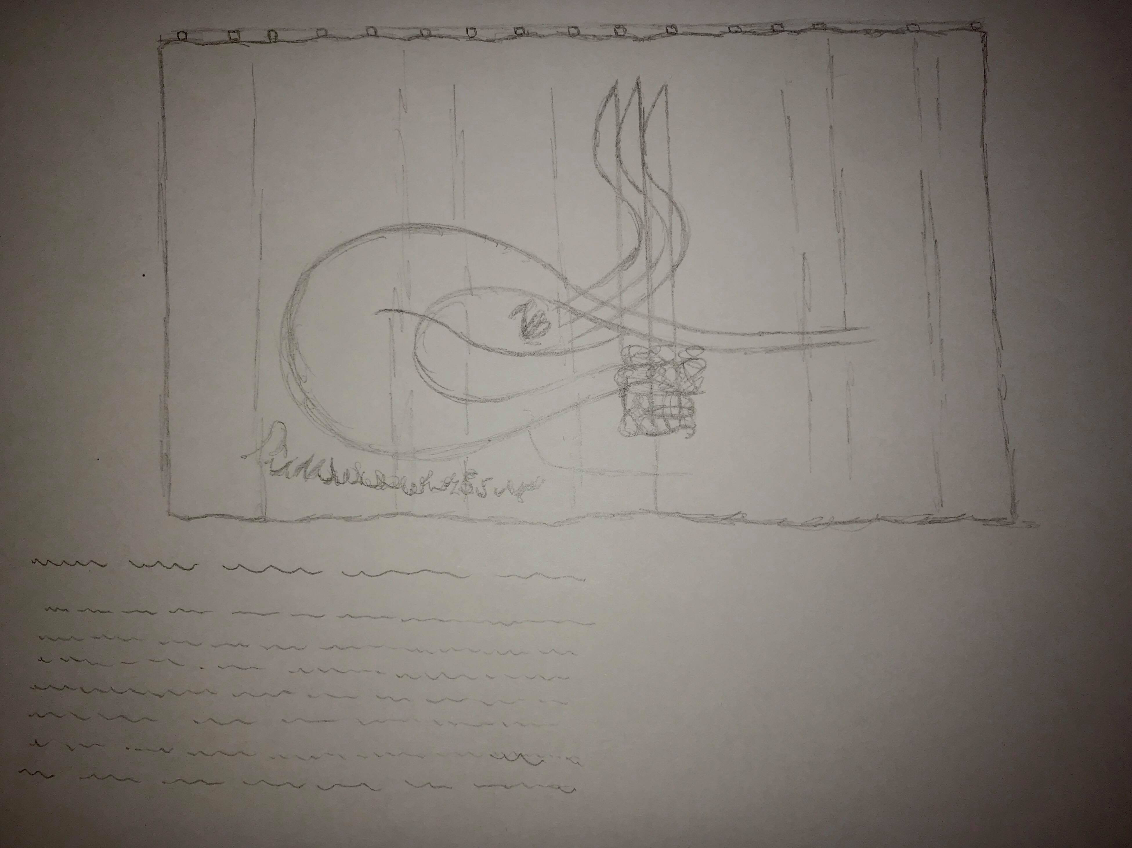
As for the modes of presenting this piece of art, I would firstly have it on display in an exhibition that showcases Ottoman era art. It would be embroidery on fabric, hanging from a pole, with an explanation and brief history of the art piece featured underneath. Preferably. the exhibition would be held at a museum like the V&A, because it features art from many parts of the world, and even has an Islamic art section, which suits this piece of art very well.
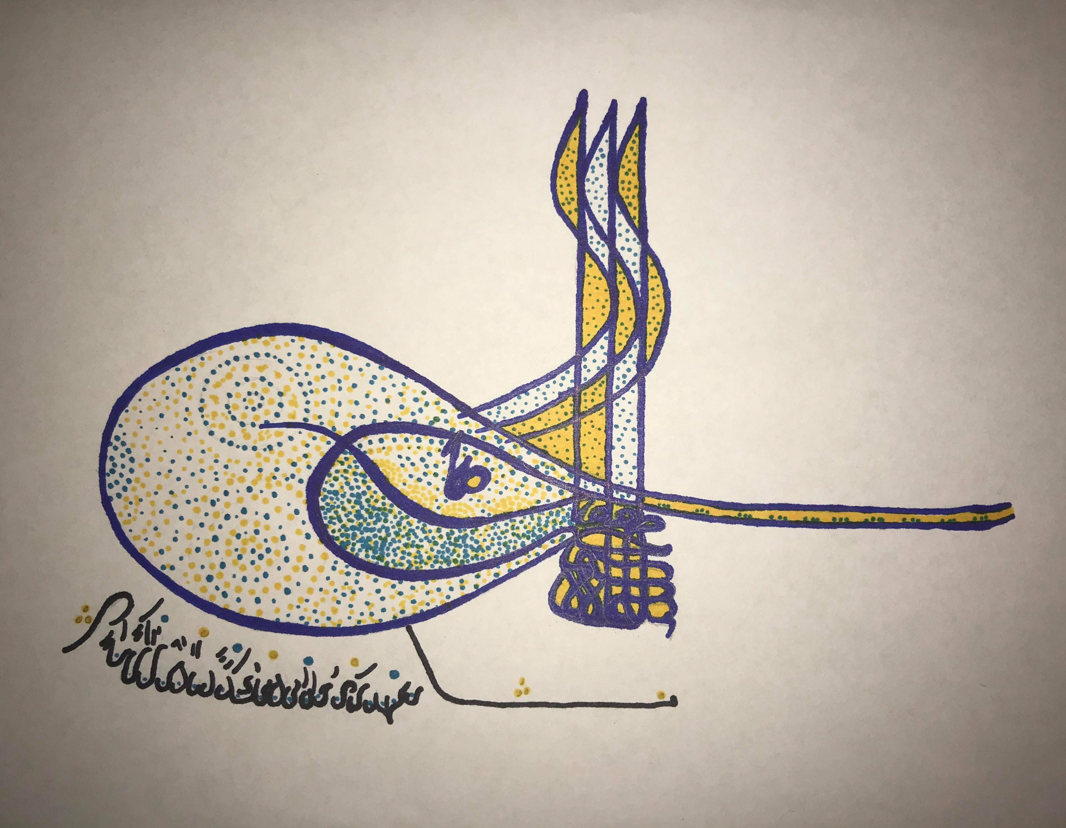
The Tughra of Suleiman The Magnificent
The second mode of presentation would be on a social media platform such as Instagram. This is because I would want this piece of art to be able to reach all parts of the world, rather than just anyone that happens to find themselves in a gallery/museum in London. Especially considering the large population of Muslim people on Earth, this piece would be sure to attract a large portion of interest worldwide, as well as potentially intriguing those of other faiths.
Tate Modern Visit 9/11/17
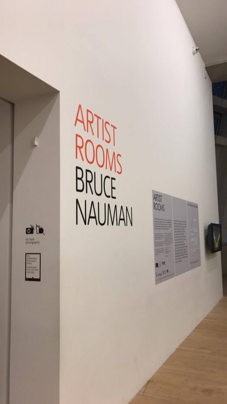
Having searched around and hit a blank as to what archive to research and centre my project around, I decided to visit the Tate Modern gallery. The gallery itself isn't an archive in the sense that this module means but I went anyway looking for inspiration. Having explored almost all of the gallery and pondered upon many ideas, I came to an 'Artist Room'; Bruce Nauman.
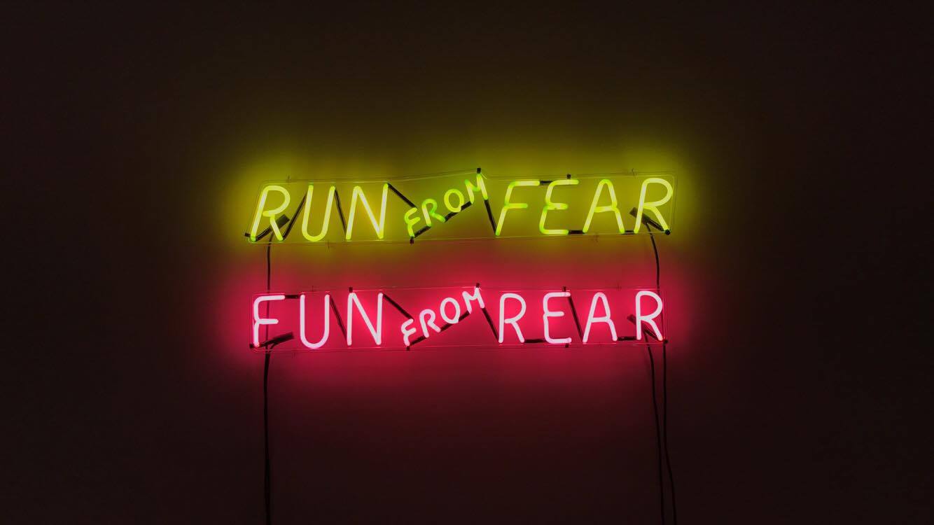
Bruce Nauman is an American artist that practises in many different mediums; photography, sculpture, drawing, video, neon, printmaking and performance. "Much of his work is characterised by an interest in language, often manifesting itself in a playful, mischievous manner. He has a strong interest in setting the metaphoric and descriptive functions of language against each other. For example, the neon Run From Fear - Fun From Rear...He seems to be fascinated by the nature of communication and language's inherent problems, as well as the role of the artist as supposed communicator and manipulator of visual symbols."
"Nauman's use of neon as a medium was very recurrent in his works. He uses neon in irony by making allusions to the numinous connotations of light, similarly to Mario Merz, who used neon to bring new life to assemblages of mundane objects. Neon also the public atmosphere by the means of advertising, and in his later works he uses it ironically with private, erotic imagery as seen in his Hanged Man (1985)." - Wikipedia
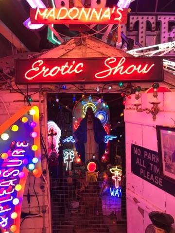
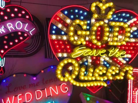
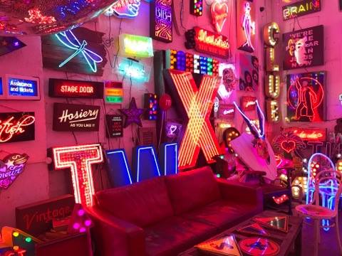
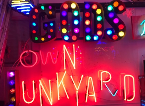
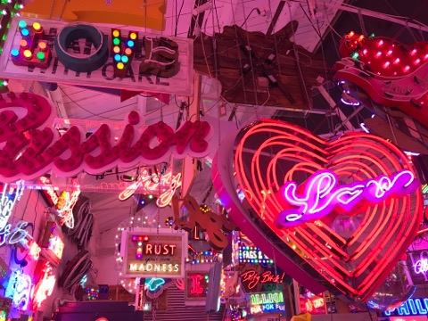
After viewing this artist room, I think I have decided on neon light art as my archive. Having phoned the Tate and enquiring about possible neon archives, I was told that there isn't really an archive of actual art, instead it comes under art storage, which is very difficult to gain access to. Therefore, I intend to visit God's Own Junkyard and Lights of Soho.
Art as Anthropology in Art, Anthropology and the Gift by Roger Sansi
- This book is a look at the complex relationship between art and anthropology. Roger Sansi first traces the similarities between the two subjects, beginning with the emergence of modern anthropology and avant-garde art in the early 20th century through to anthropology's crisis of representation and art's critique of the institutionalisation of artistic practices later in the 20th century.
Sansi recalls how Andre Breton often made reference to Lautreamont's line: "beautiful as the chance meeting on a dissecting table of sewing machine and an umbrella" (Lautreamont 2011). This chance meeting is not just the superposition of two radically different things, but the chance meeting between them. Breton rephrased this line saying that "beauty will be convulsive or will not be at all" (Breton 1999), meaning that the viewer has to be convulsed by the experience.
Sansi recognises that the question of objective chance itself is highly important for anthropology, especially through Claude Levi-Strauss; he introduced the metaphor of bricolage to address how the limits of our knowledge relate with the limits of our world. We are only able to work with what is in our possession; the elements with which we organise our world are 'pre-concrete', subject to contingency. It is this contingency that ultimately forces us to change our projects to what is possible. Once the project is complete, it will be inevitably disproportionate to the initial intention. In other words, human practise is always limited by the world at hand. Surrealism is highly emphasised in this chapter, with Sansi recognising that 'notions of the found object, objective chance the dialectical image and montage show that the surrealist process does not operate just by producing a collage of images, of superimposing different objects, different cultures, to develop a critical perspective on both; much further than that, surrealism stresses the dynamic dimensions of encounter, the convulsions, the transformations that this encounter between people and things produces.'
Relational art doesn't pretend to lead a general revolution, but local interventions. It could be said that in the recent past, multiple art projects work with the immediate problems of today, in specific places with specific communities, as opposed to a general revolution of the future. The emphasis of location-specifity has made anthropology key to modern art practise.
A couple of questions can be raised from this; to what extent do the practises of these artists meet the anthropological standards? and perhaps rather than asking if they are using anthropology properly, one could ask what they are using it for. To address the latter, we must come back to how the reunion of art and everyday life is envisioned. The elements of this process can be very diverse and Sansi goes on to explain this later on in the book.
'Relational Aesthetics by Nicholas Bourriaud
The extracts from this book discuss how the meaning of art has changed as society and current events have changed. Not only do spectators pick up the intended meaning of art, they pick up the context of the art and the time in which it was created. The term 'relational aesthetics' was coined by Nicholas Bourriaud to describe the tendency to create art based on or inspired by human relations and their social context. Relational aesthetics takes the subject as it is lived, as opposed to removing it from its social environment.
These days, communications are pushing human contact into monitored areas that divide the social bond up into different products. Artistic activity, aims to achieve modest connections, open up obstructed passages, and connect levels of reality that were once kept apart from one another.
'The ideal subject of the society of extras is thus reduced to the condition of a consumer of time and space. - anything that cannot be marketed will inevitably vanish.
'The space of current relations is thus the space most severely affected by general reification. The relationship between people, as symbolised by goods or replaced by them, and signposted by logos, has to take on extreme and clandestine forms, if it is to 'dodge the empire of predictability.'
'The supreme "separation", the separation that affects relational channels, represents the final stage in the transformation to the "Society of the Spectacle" as described by Guy Debord. This is a society where human relations are no longer "directly experienced", but start to become blurred in their "spectacular" representation.'
'A work of art has a quality that sets it apart from other things produced by human activities. This quality is its social transparency...
At the beginning of art we find the behaviour adopted by the artist, that set of moods and acts whereby the work acquires its relevance in the present...
The "transparency" of the artwork comes about from the fact that gestures forming and informing it are freely chosen.'
God's Own Junkyard - Archive Visit 09/12/17
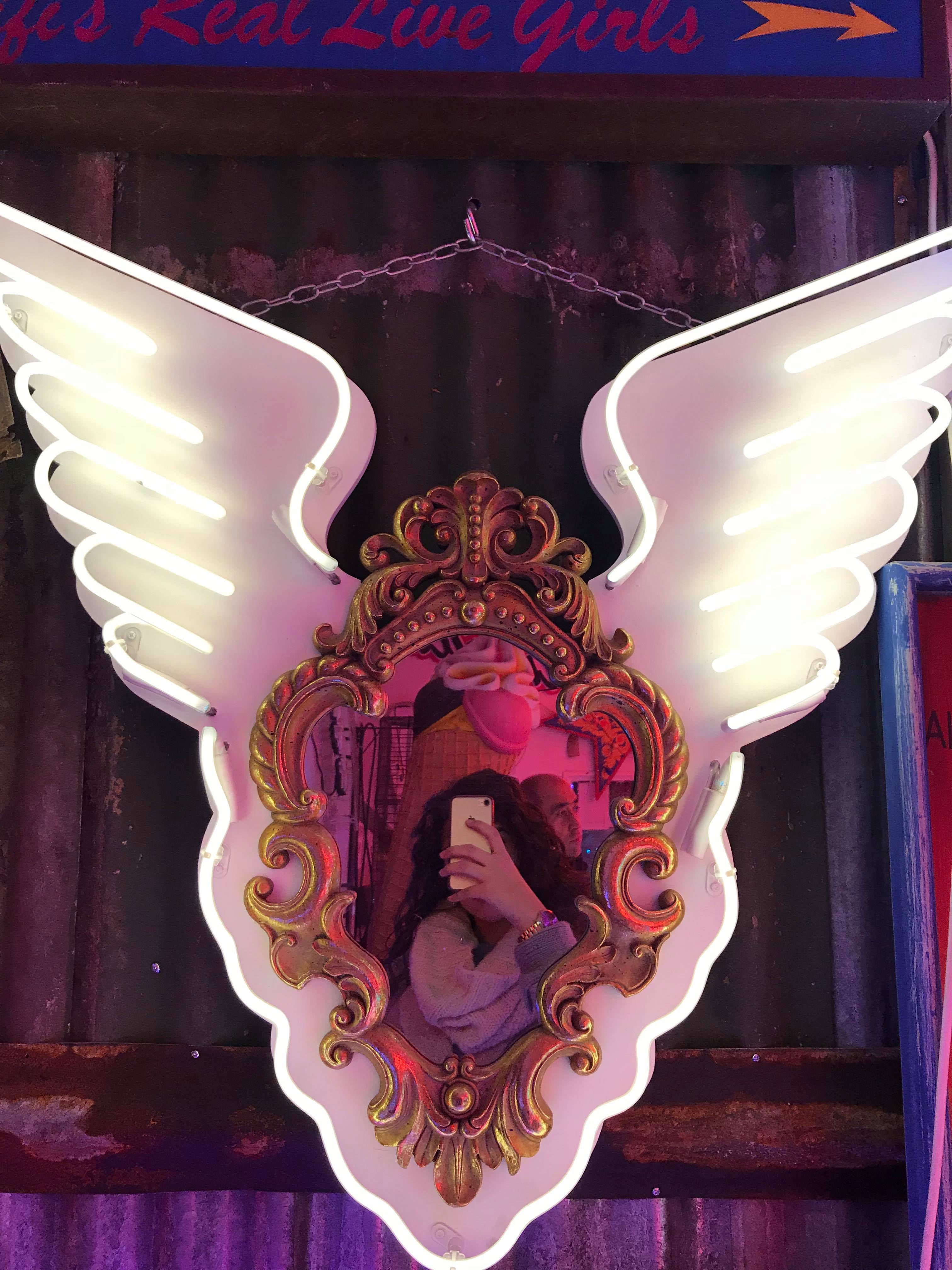
Having decided to use a neon light archive as my project basis, I researched places that house neon light artworks. I came across a gallery called Lights of Soho, in London. However, perhaps due to my poor research, upon reaching the location, I discovered that it had shut down. So it seemed that I was only left with God's Own Junkyard as a possible physical archive, based in Walthamstow, London. God's Own Junkyard showcases Chris Bracey's large collection of neon light artworks; everything from Soho sex clubs signs to those used in movies such as Captain America, Byzantium etc with the collection of works created by Chris Bracey himself. Bracey was originally a graphic designer but later decided to join the family business of neon light works. He helped to shape the Soho sex industry, creating '99% of every sex establishment in Soho for 20 years' (Bracey 2013). He was then also commissioned for multiple films such as Eyes Wide Shut (dir. Kubrick 1999) and Mona Lisa (dir. Jordan 1986).
I managed to speak to the curator of the archive, Jon Blake, whilst I was there. It seemed that, due to my lack of direction and lack of solid questions to ask him, he really couldn't help me. This highly disappointed me because I was hoping that, once there, I could gain a real insight into the general archive and then find something that sparked my interest. He told me to go home, think of actual questions and then come back and talk to him. So, I did just that.
Upon going home and reflecting on my brainstorm and the archive visit, I realised that I really don't have any direction in this archive and I am finding it very difficult to think of possible areas to research that relates to neon light artwork. I am back to square one.
Bracey. C, 2013. in 'Chris Bracey, neon sign designer and collector, dies at 59' http://www.bbc.co.uk/news/entertainment-arts-29903736
The Search for a New Archive Idea
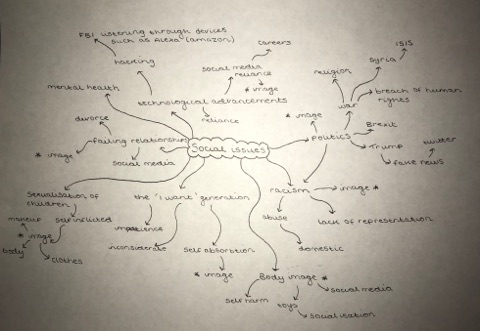
After hitting a blank multiple times now, I decided that perhaps it might be easier if I was to think of possible research question topics first, and then find an archive that might facilitate what I want to research and create an artwork in relation to. I figured out that I want my piece to portray a certain message about society in some form. However, I also wanted the message/main topic to be something that I either have personal experience in, know a lot about or have a very keen interest in. Again, I decided to brainstorm some ideas as I find this very useful:
Upon completing the brainstorm, it became very apparent to me that image is something that appears quite a lot on it. This whole idea that image; our self image, the image of the world, how we see images presented to us, is very prevalent. Image comes into most, if not all, social issues and it is something that I have often found myself obsessing over and worrying about for a lot of my life. I feel that, since I have first hand experience of what it is like to see constant images in the media of proposed 'perfection' and the feeling of inadequacy that comes with that, image would be a suitable place to start in. Body image is the main topic that I will focus on.
Research Question Ideas
From my new topic, being body image, I have conjured up some possible research questions that I will tailor to my archive, when I find a suitable one.
- How does our own perception of our bodies influence the way in which we view the people around us?
- How far is the 'perfect' body decided by producers? -> media producers
- Are consumers passive in accepting the proposed idea of the 'perfect body'? -> hypodermic syringe theory
- How has film influenced our idea of the ideal body type? -> Bond girls, the damsel in distress
- How has television influenced our idea of the ideal body type? -> Game of Thrones, MTV, the 'popular' character
- How has social media influenced our idea of the ideal body image? -> fitness accounts, surgery accounts etc
- How far does primary socialisation influence our perception of ourselves? -> family, toys
- How far does secondary socialisation influence our perception of ourselves? -> toys, friends
Does Barbie Make Girls Want to be Thin? The Effect of Experimental Exposure to Images of Dolls on the Body Image of 5-8 year old Girls - H. Dittmar, S. Ive & E. Halliwell, 2006
In their experiment 'a total of 162 girls, from ages 5 to age 8, were exposed to images of either Barbie Dolls, Emme dolls (U.S. size 16), or no dolls and then completed assessments of body image.' The professors discovered that those exposed to Barbie doll images produced 'lower self-esteem and a greater desire for a thinner body shape than in the other exposed conditions.'
Although, the oldest girls in the study did not have an immediate negative impact from the Barbie doll images, the study concluded that 'these findings imply that, even if dolls fail to function as aspirational role models for older girls, early exposure to dolls depicting an unrealistically thin body ideal may damage girls’ body image, which would contribute to an increased risk of disordered eating and weight cycling.'
Dittmar et al suggested that the difference in attitudes amongst the different age groups that the study showed can be explained by the fact that the girls under the age of 7 and a half are still developing a self-concept and therefore use Barbie actively as a reference norm, whereas girls older than 7 and a half years have already digested and accepted the ideal of being thin as a self-concept structure.
This study proves the fact that Barbie has some kind of influence over children. Since young girls play with these dolls, they are the most influenced by her, due to their young age. The use of these dolls in primary and secondary socialisation allows for children to idolise these dolls, being highly influenced by them.
The Effects of Playing with Thin Dolls on Body Image and Food Intake in Young Girls - D.J. Anschutz and R.C.M.E Engels, 2010
This study experimented with the effects of playing with thin dolls on body image and food intake in 6- to 10-year-old Dutch girls. Girls were randomly given either a thin doll, an average-sized doll, or Legos, in a no- doll control condition to play with. After a duration of 10 minutes, the girls took part in a taste-test and filled in questionnaires about body image. There were no differences found between conditions for any of the body image variables. However, girls who played with the average-sized doll ate significantly more food than the girls who played with the other toys. Although no substantial support was found for the assumption that playing with thin dolls influences body image, the dolls directly affected the actual food intake in these young girls.
This study identifies that, despite the extensive conversations and arguments regarding dolls in relation to body image, there really is only one experimental research study that has been done, that being the study conducted by Dittmar et al.
Anschutz and Engels attempted to extend Dittmar et al's study by getting the subjects to actually play with a thin doll versus an average sized doll. The researchers do recognise that magazine exposure might indirectly push a more aggressive idea of 'norms', due to its mass reach as a form of media exposure and the media is known for setting social and cultural norms regarding appearance even in young children.
It is important to keep in mind that the young girls in the study were aware of the body size of the dolls, so the lack of effect on girls’ body image can't be explained by the fact that they did not notice the dolls’ body sizes. Still, when exposed to a real doll, the researchers state that the girls might experience less external pressure, because they are in control of the play and no overt norms are imposed by the environment.
The study found that, while the different types of dolls that were played with did not necessarily influence the body image of the girls in the study, they did affect the food intake of the girls; it found that the girls who played with the thin dolls ate significantly less than those who played with the average sized dolls.
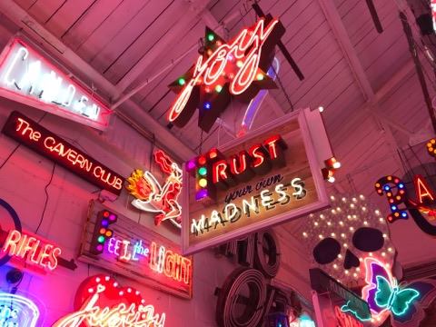
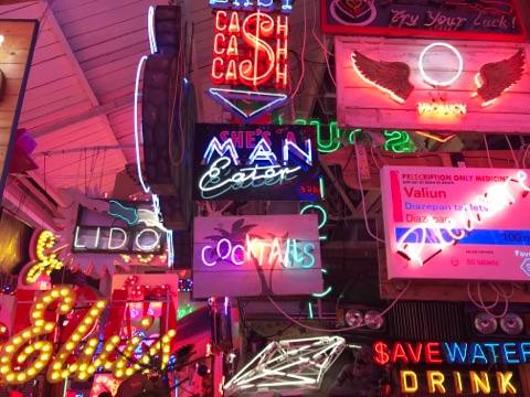
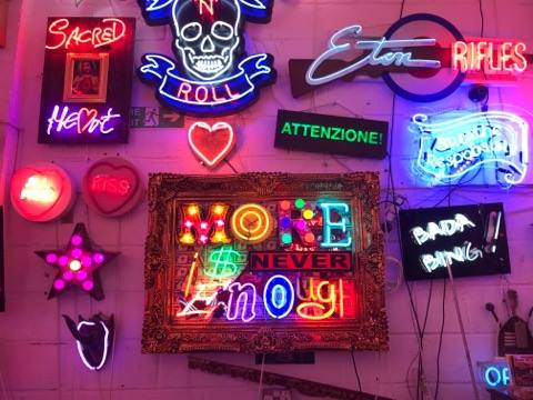
Interior Design Archive Brainstorm
Upon researching more about the Interior Design archive, I decided to brainstorm some possible ideas for research questions and art project ideas in order to make it easier to see a direction for my project. As can be seen above, I ended up venturing out to the idea of set design, which could perhaps be facilitated by the BFI. While these two topics are those of interest to me, I found it difficult to think of a possible route that would provide me with enough substantial material to create a piece of art.
This difficulty has slightly put me off of the idea of using the Archive of Interior Design, or even a possible set design archive.
Double Poke in the Eye II
Run From Fear Fun From Rear
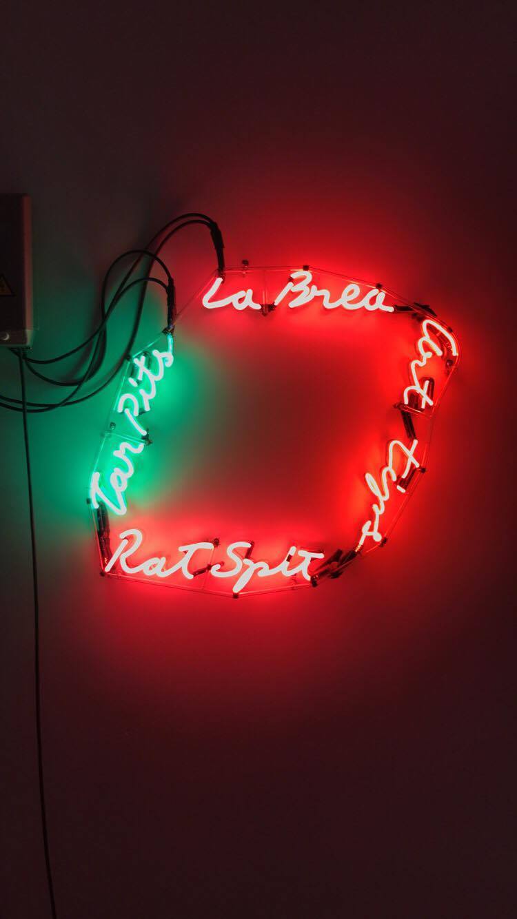
La Brea/Art Tips/Rat Spit/Tar Pits
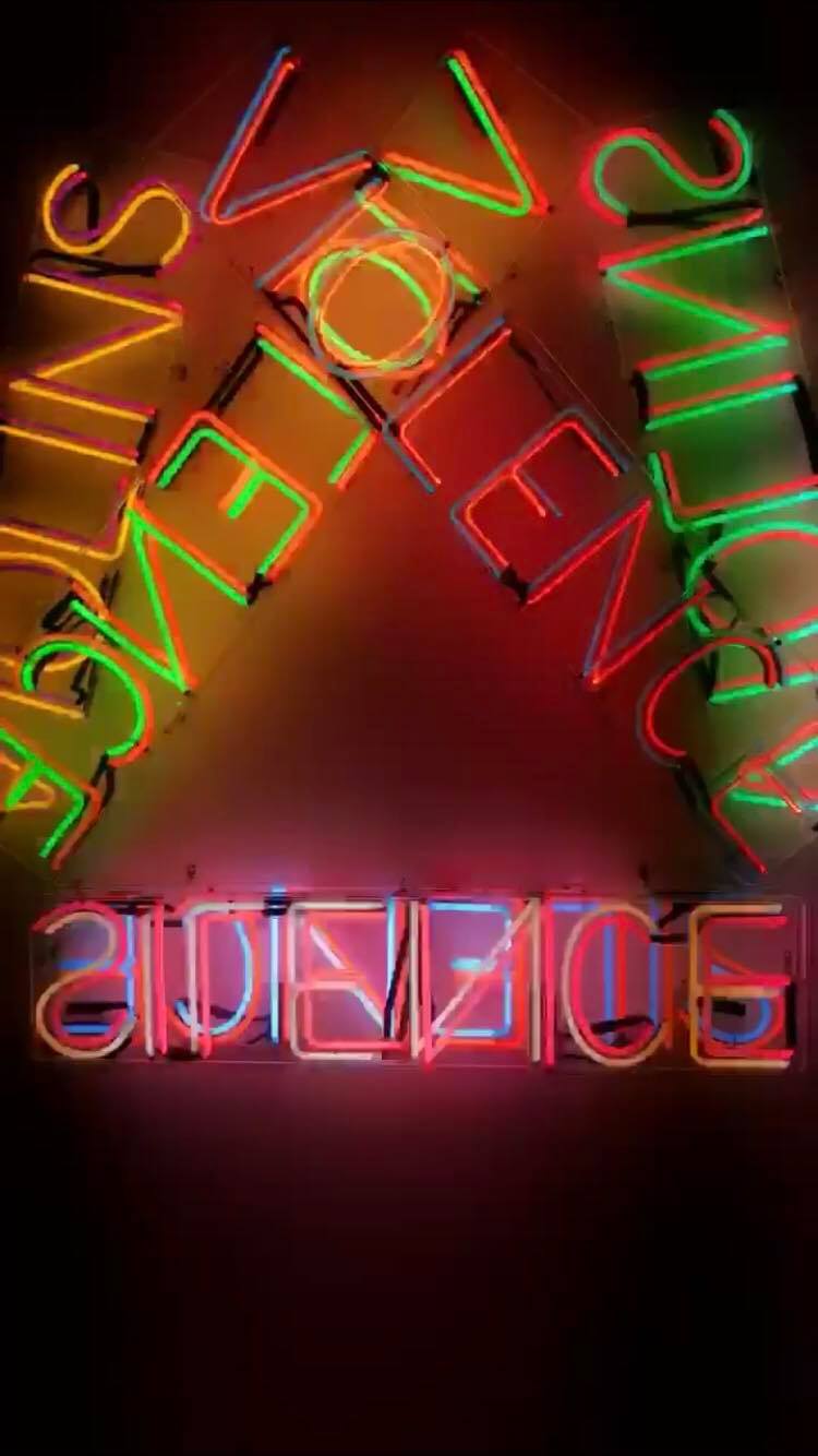
Violins Violence Silence
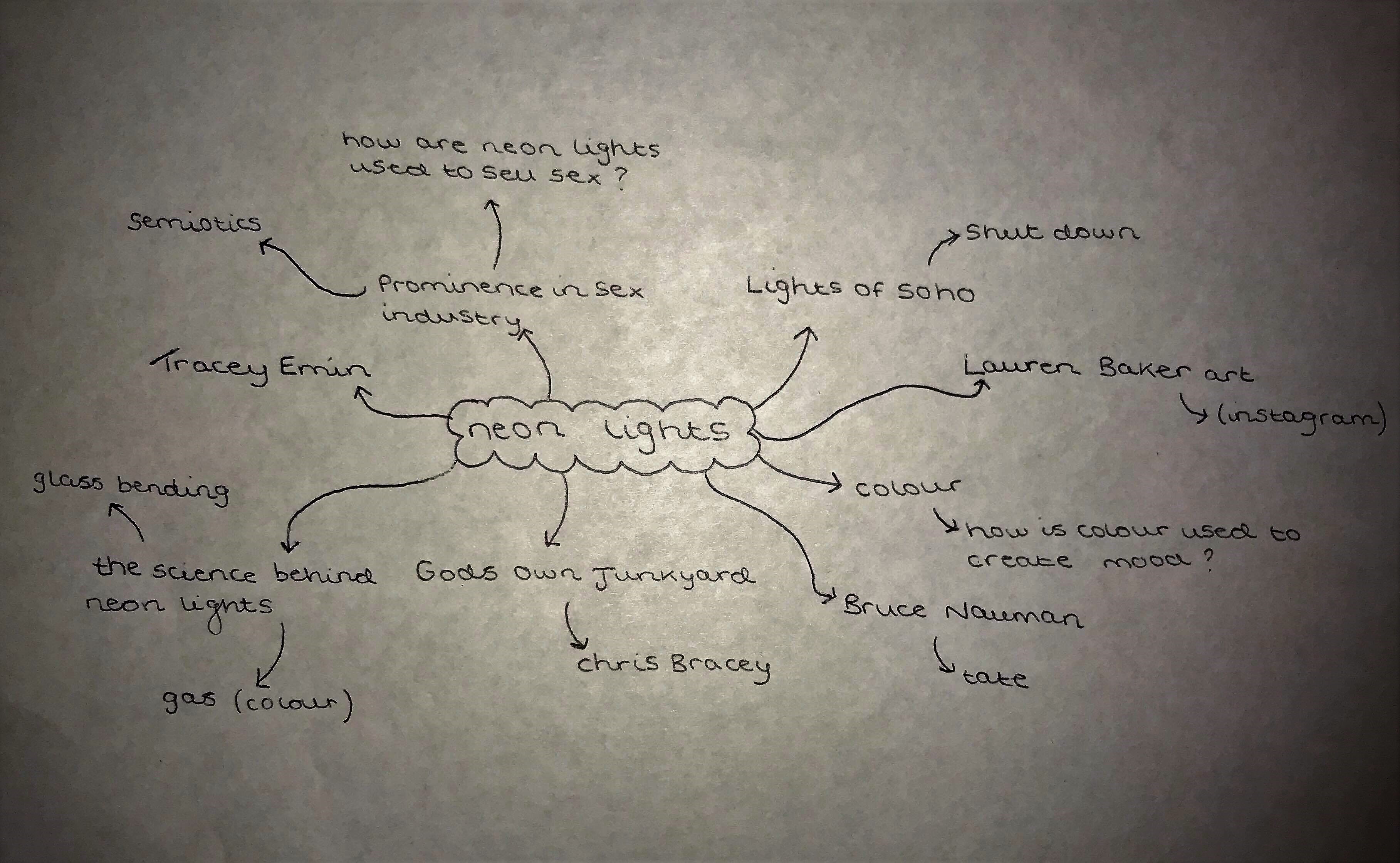
Neon Light Archive Brainstorm
Having only just found a possible new interest for the archive, I figured I would brainstorm this idea, much like my first brainstorm, as it really helped to clarify whether or not there is enough solid information and guidance for the topic. I feel like once I visit the archive(s) I will have a much clearer idea of what direction I might like to take.
The Archive of Dolls at the V&A Museum of Childhood
Thinking about the idea of primary and secondary socialisation in relation to the ideologies that producers send out to consumers, the idea of dolls and their influence over children during their early years came to mind. Dolls are those toys that almost every child has at least one of, whether its a Barbie, a Bratz doll, whether it was Sindy, Cabbage Patch, or even Action Man and G.I Joe.
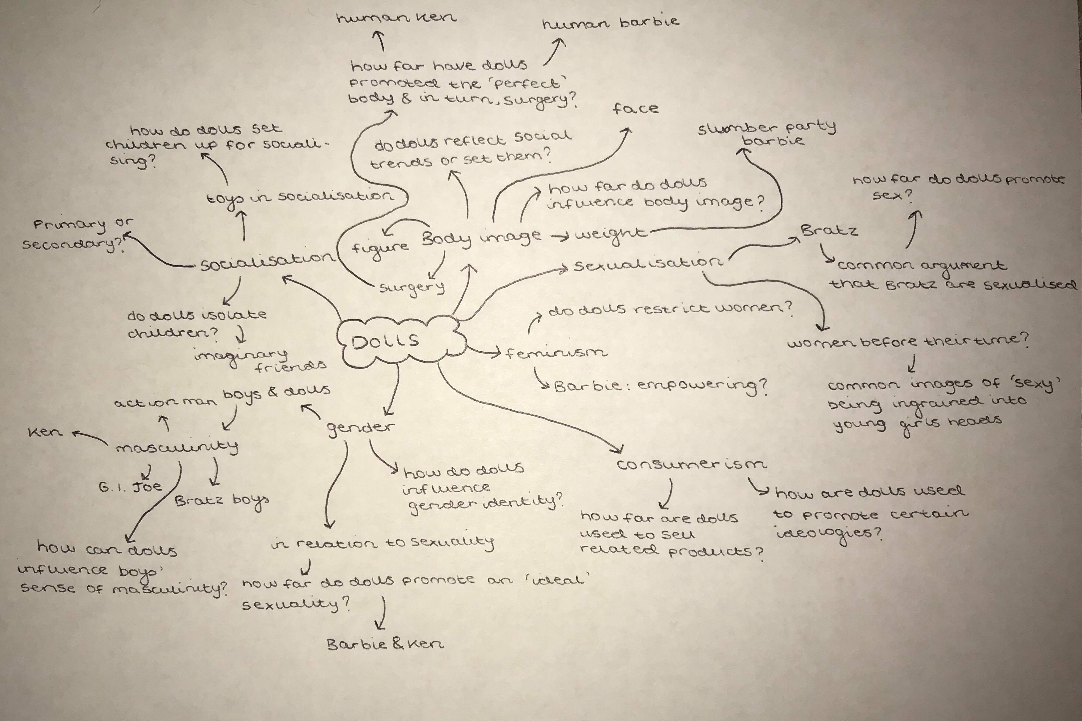
Upon researching and looking for toy/doll archives, I came across the V&A's collection of dolls, based at their Museum of Childhood in Bethnal Green, separate to the main V&A Museum. Their online display (found here: http://www.vam.ac.uk/moc/?collection_type=dolls ) displays their collection categories in full and it appears to be a perfect match for the direction I think I want to take. However, there are many social issues related to dolls, so yet again, I brainstormed for other possible routes to take for the research proposal, to make sure that I am confident in my topic reducing the likelihood that I will find that I have no direction or want to change my subject:
Having completed this brainstorm, and looking at existing research regarding dolls, body image seems to still be the most prominent topic in relation to dolls and I feel confident that the V&A's collection of dolls will be my archive!
Random Gallery Visits 24/11/17
In my state of panic over still not having an archive that I would like to work with, I decided to visit a number of galleries around London, in hopes of gaining some inspiration. However, I had no luck.
Despite not getting inspired by anything I saw, I still came across some interesting artworks;
I forgot, however to look at the names and artists of the pieces.
Lauren Baker Art - Neon works 08/12/17
In relation to my quest for seeking out a neon light archive, and relevant possible research proposals to go with it, I found an artist called Lauren Baker on Instagram. She has her own gallery near Covent Garden, where some of her work is on display. At this point in time, her solo show 'Walking Towards the Light' is being exhibited, which displays her neon light artworks, so I decided to take a look.
To the Moon and Back and Infinity
Unraveling the Cluttered Mind
The Moon Made Me Do It
Everything is Going to be Fucking Amazing
Self Conducted Research:
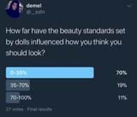
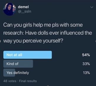
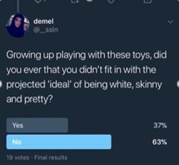
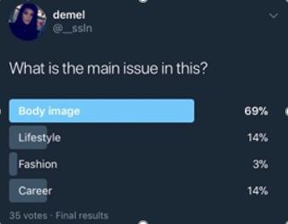
In order to gain my own understanding of the effects of dolls on body image, series of Twitter polls were conducted from my personal account, addressing girls only, asking questions about dolls and their impact on girls and their perception of themselves.
Although twitter polls aren’t exactly reliable sources of information, the polls conducted correlate with the Dittmar et al study in saying that older girls tend to not be as affected by the image that dolls portray. Twitter polls aren’t necessarily reliable because of their anonymity for one thing; the element of anonymity might encourage people to answer more truthfully but it also means that the researcher doesn’t know who’s actually answering the questions, so even though the first question in the thread indicated that it was directed at girls only, boys could have answered too. It also doesn’t allow for the researcher to know what age all of the respondents are, making the sample very wide and random. I didn’t want young children to be the subject of my research due to ethical issues and issues in gaining access. I also wanted to follow the university’s guidelines of not researching people under the age of 18. As you can also see, each question received a different number of responses, making it rather invalid and unreliable, with the first obtaining 48, the second 35, the third 27 and the fourth 19. While the results conclude that these respondents don’t feel pressured by the image that dolls present and portray as ideal, they do mostly recognise that body image is the main issue that the dolls raise.
Ken and Barbie at Life Size - Norton. K.I, Olds T.S, Olive. S, & Dank. S, (1996)
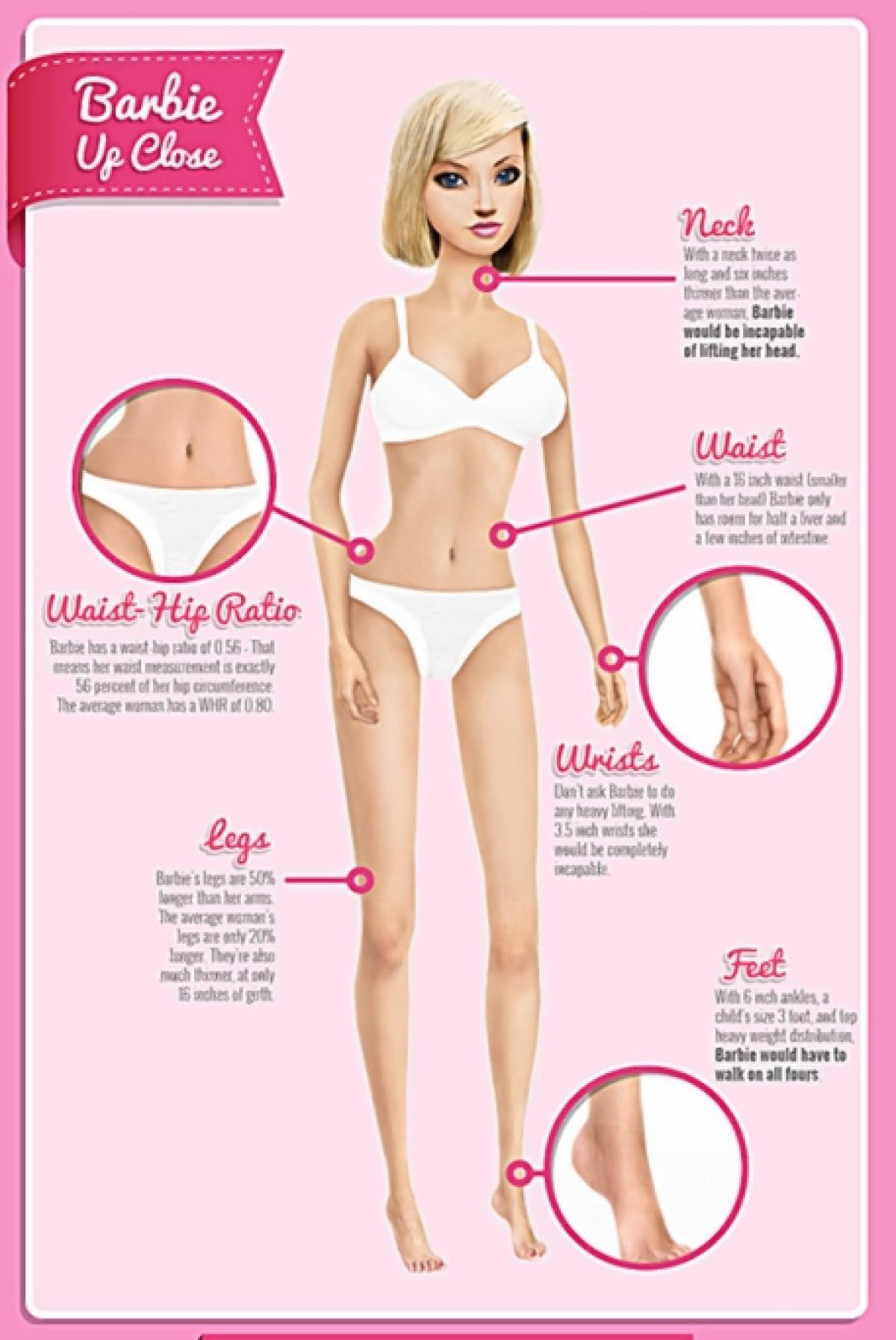
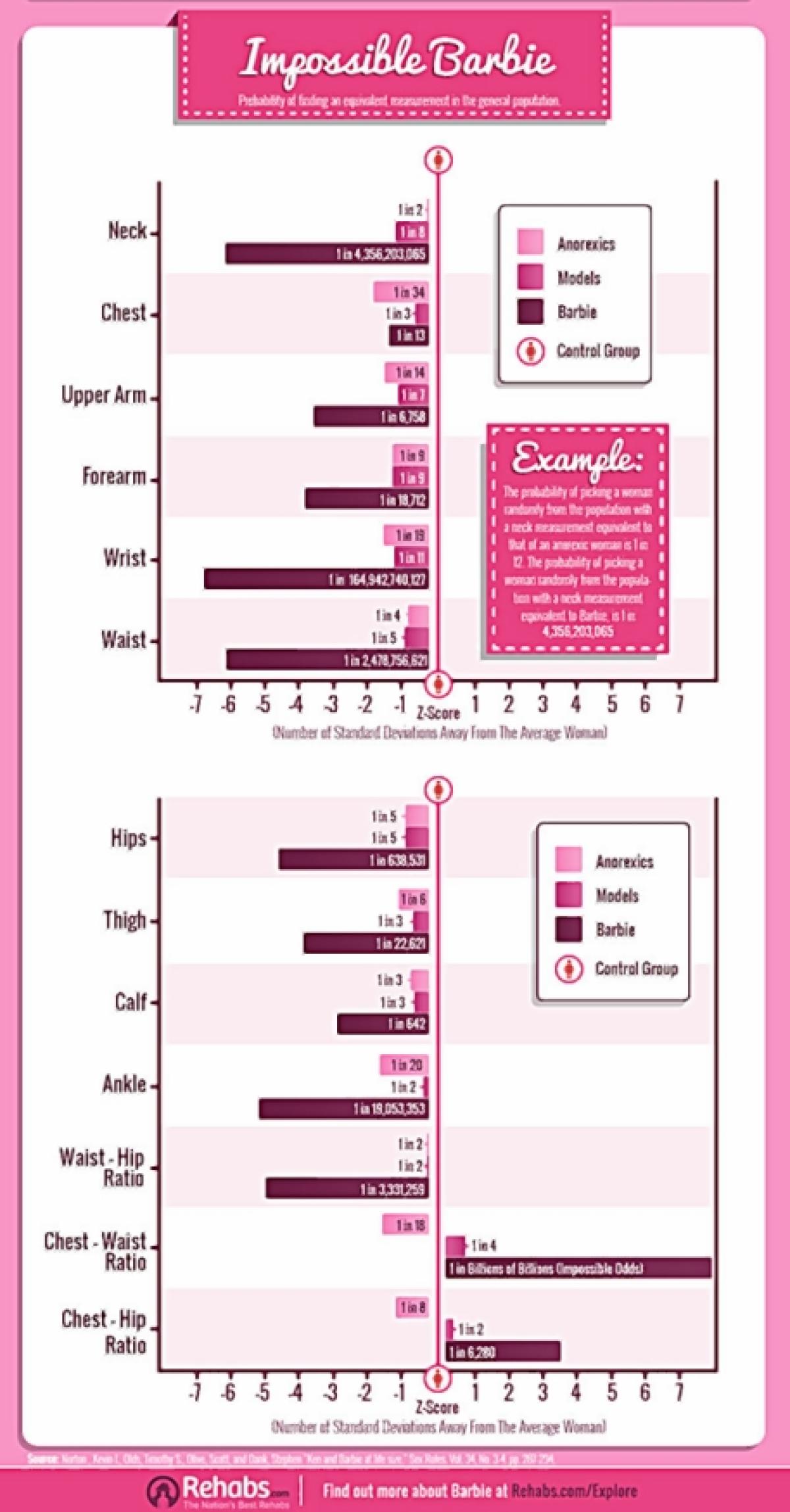
Upon looking further into this issue of dolls in relation to body image, this series of images is what particularly struck me. Barbie is supposed to be 5 foot 9 inches tall, weighing 110 pounds, Rehabs.com reports, saying that with proportions such as this, she would not be able to menstruate. Norton et al compare Barbie to the real average woman, concluding that Barbie’s figure is impossible to achieve. They state that Barbie ‘would be incapable of lifting her head’, she ‘only has room for half a liver and a few inches of intestine’, ‘with 3.5 inch wrists, she’d be completely incapable’ of doing any heavy lifting and with children’s size 3 feet and 6 inch ankles, ‘Barbie would have to walk on all fours’.

Exhibition Piece Idea #1
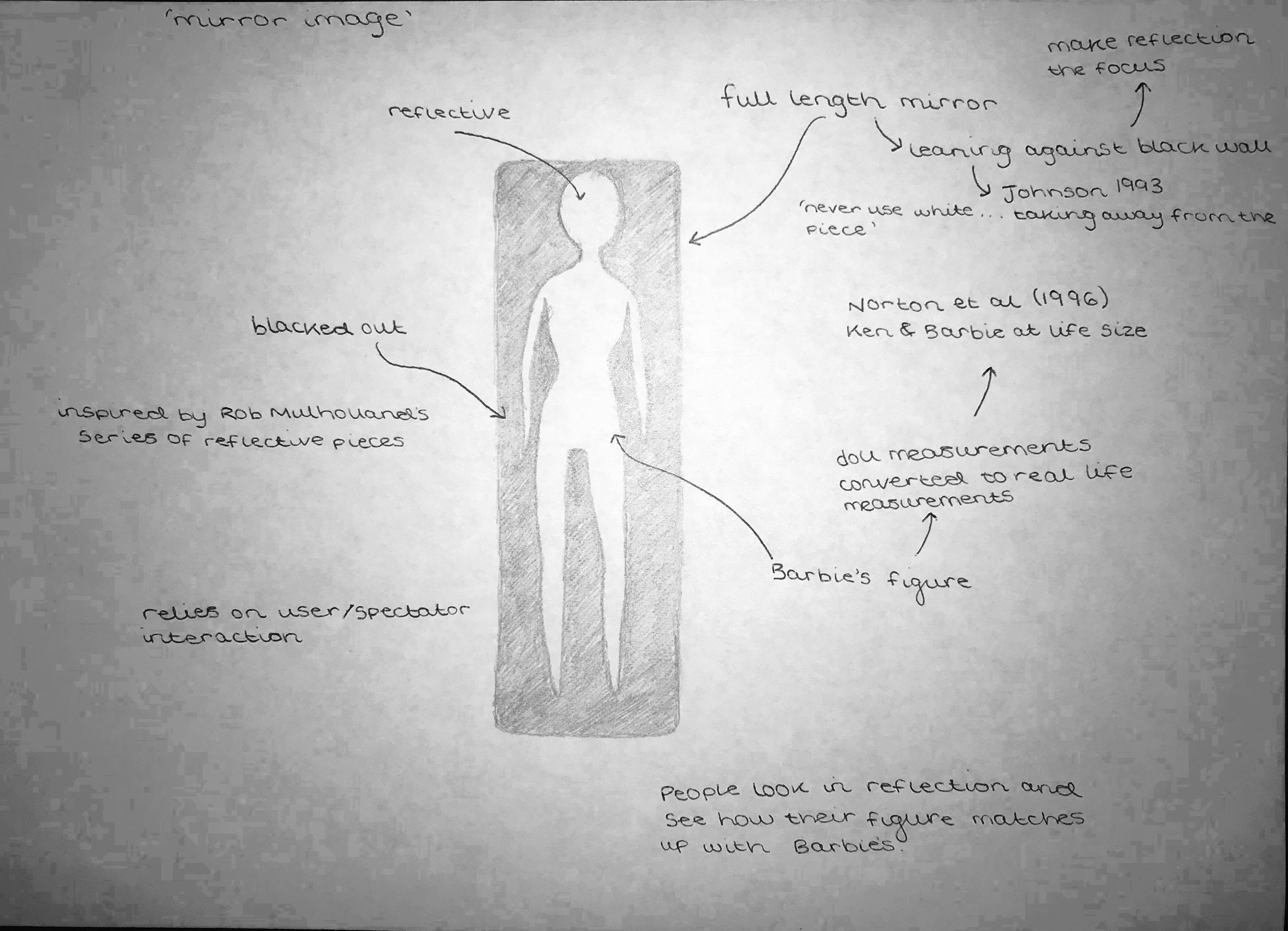
'Mirror Image'
One of the initial ideas I have for the exhibition is to create a simplistic, minimalistic somewhat interactive piece that triggers the spectator to think about how unrealistic the images we are fed are. The idea is to have a full length standing mirror, with Barbie’s real life silhouette cut out of black paper/black paint which would be stuck onto the mirror. The interactivity comes from the spectator being the subject. It would allow them to ponder and look and observe, take selfies in the mirror and share and create conversations. The mirror would stand in the middle of a black wall, in order to keep the focus on the reflection of the spectator in relation to the cut out silhouette. Using black also adheres to what Philip Johnson stated in 1933 that you should ‘never never use white…then your frame is much brighter than your picture…if the area around the painting is brighter than the painting then you’re taking away from the painting.’ Although he is referring to paintings, this is still applicable to art pieces on display in general. The piece would be somewhat like Rob Mulholland’s series of reflective pieces, whereby the lifesize figures blend into their surroundings in order to make a statement about mans impact on the surrounding landscape over the past few centuries (Gardner 2012) . However, it would be somewhat inverted, where, instead of blending the human form in with its surroundings, this piece aims for the human form to stand out. The intended message is similar however, where my piece aims to make a statement on the impact of Barbie on girls.
Gardner. T 2012 http://www.dailymail.co.uk/news/article-2115931/The-Predator-project-Artist-creates-disturbing-mirror-sculptures-make-human-forms-blend-surroundings.html
V&A Museum of Childhood visit 9/1/18
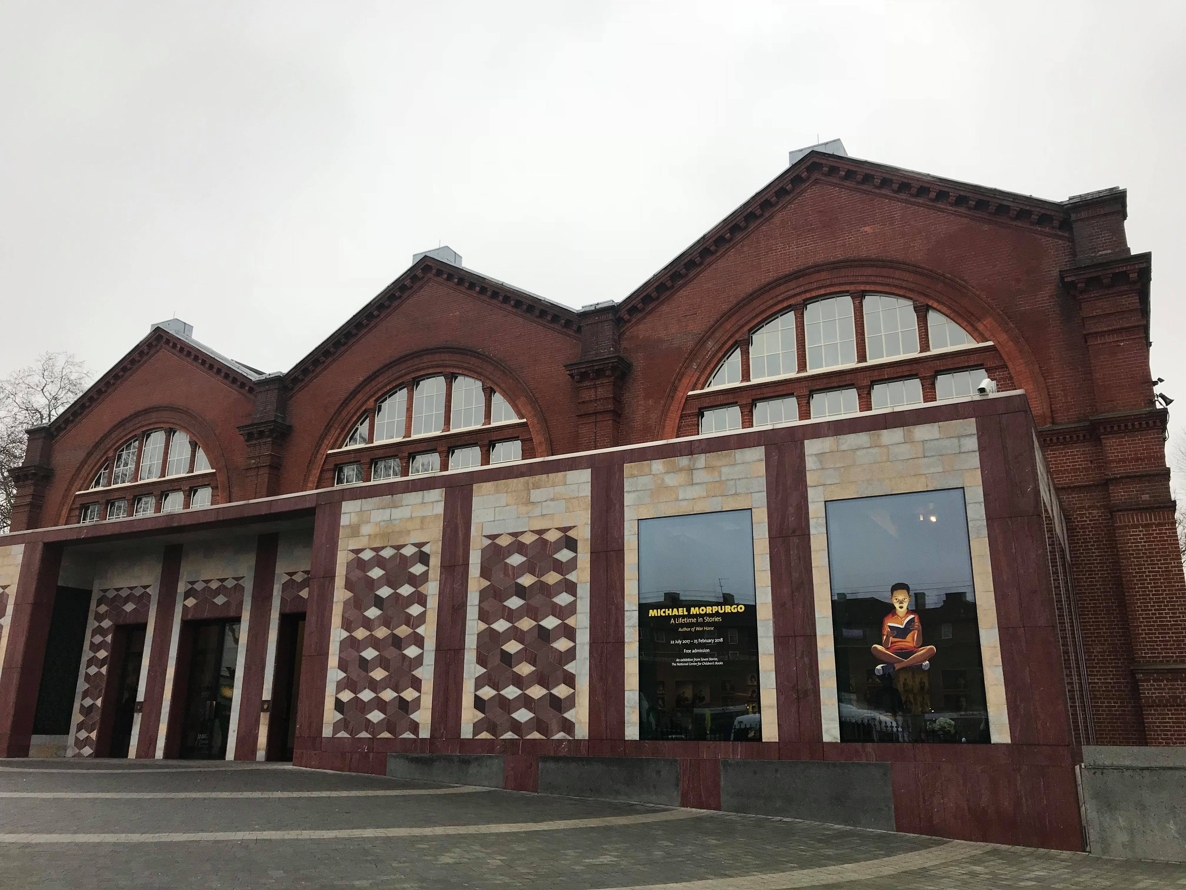
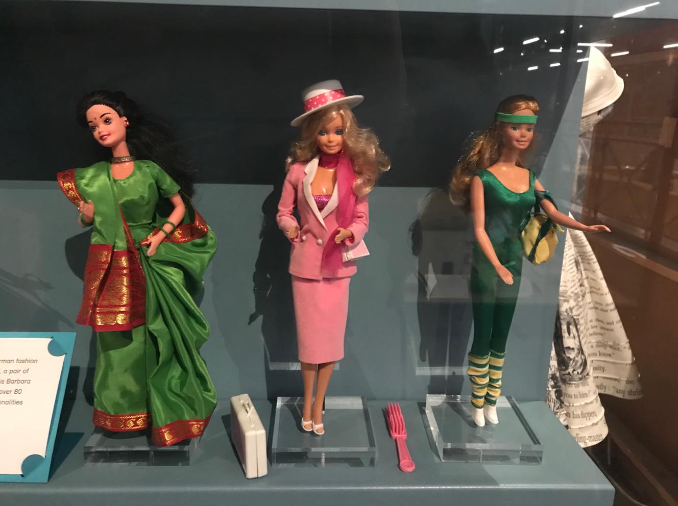
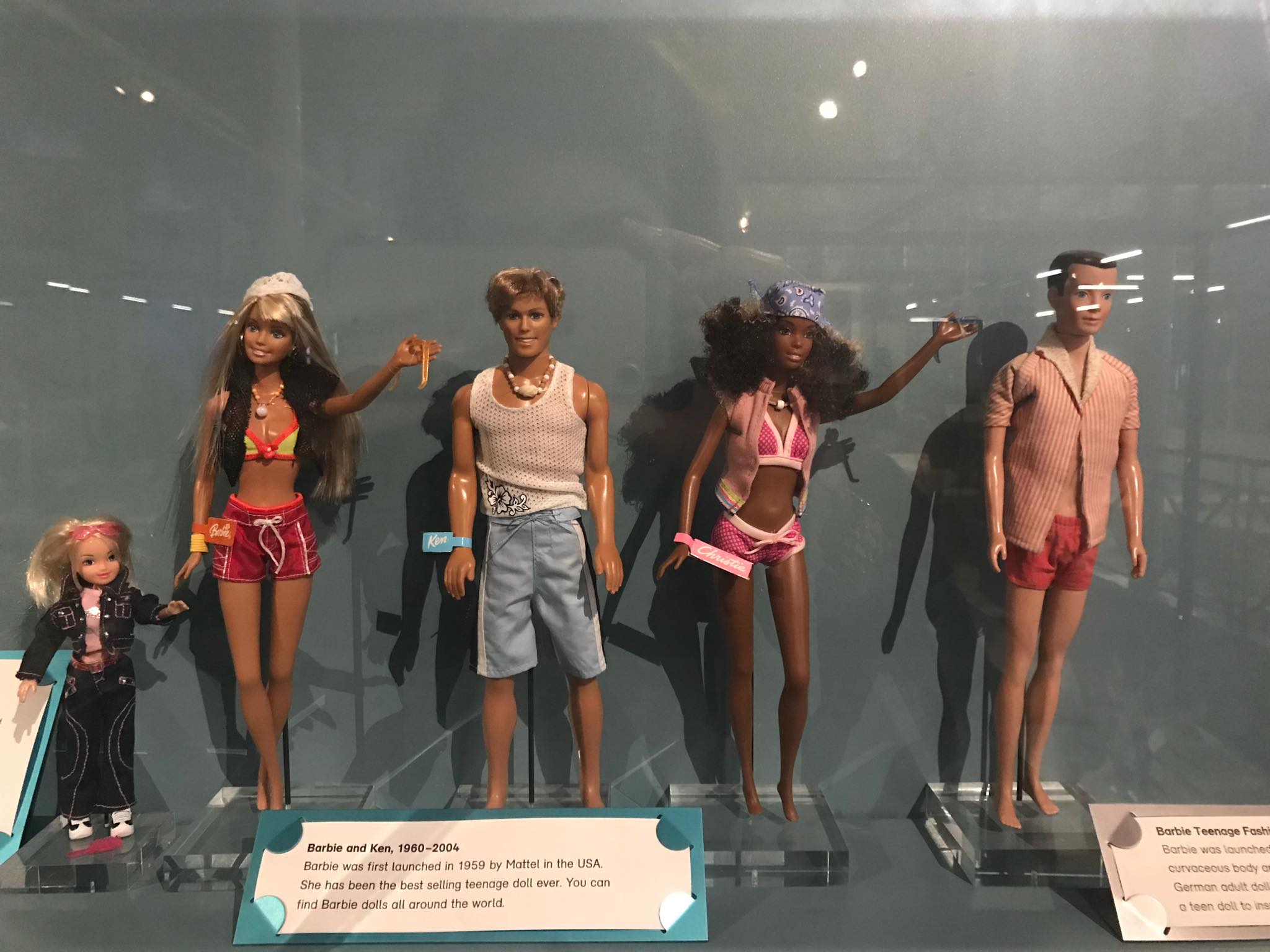
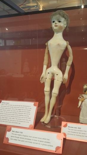
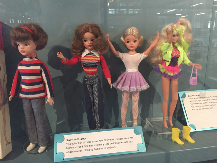
Having researched possible archives in London, I came across the V&A's Museum of Childhood in Bethnal Green, which has a collection of dolls of all types. So I visited the museum in order to take a look at their collection. For the mean time, I think I am going to focus on Barbie and her influence on body image due to her long reign as one of the most, if not the most, popular doll. The museum's collection is extensive in their range of brands, however, in their doll collection, Barbie was the most present doll; the other brands featured in the collection did not have as high a volume of dolls as Barbie. This doesn't disadvantage me at the moment, but if I decide to venture into other dolls, it may prove challenging, despite the large collection of dolls I hold at home! This visit was rather quick due to the large range of all kinds of toys that the museum has, so I plan to go back to the museum soon and take a look at the wider range.
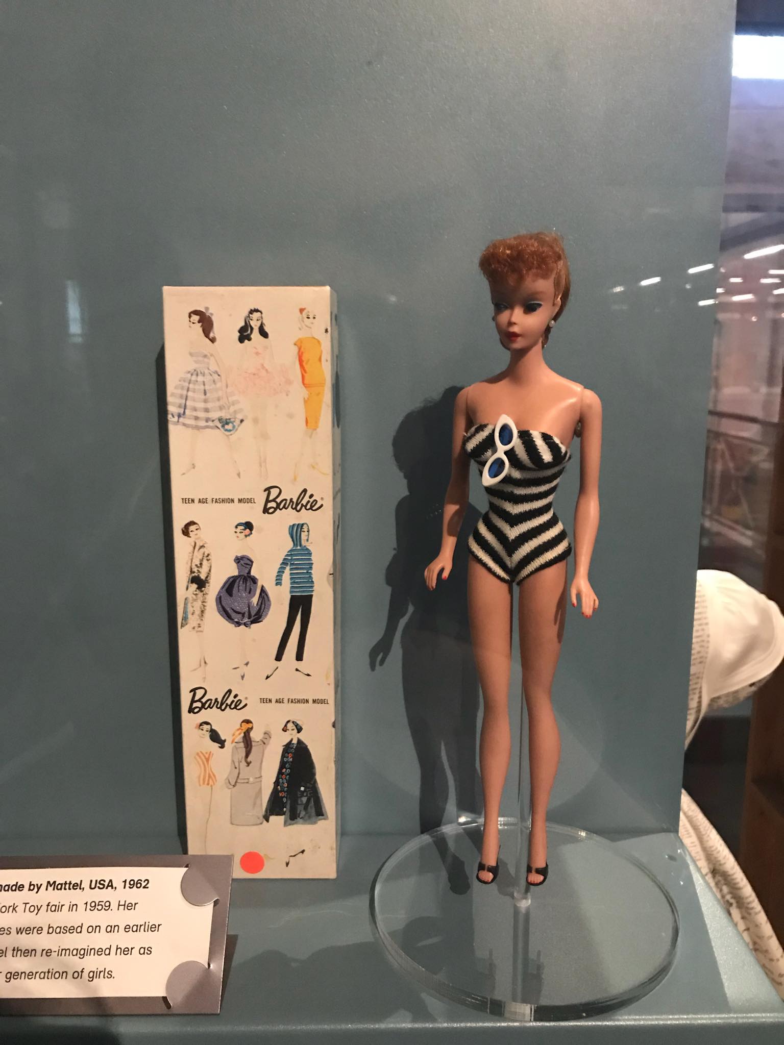
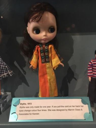
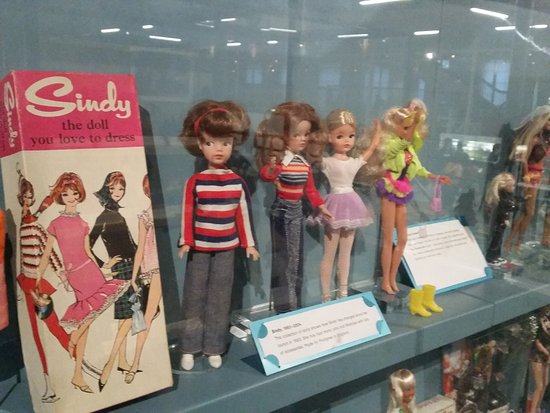
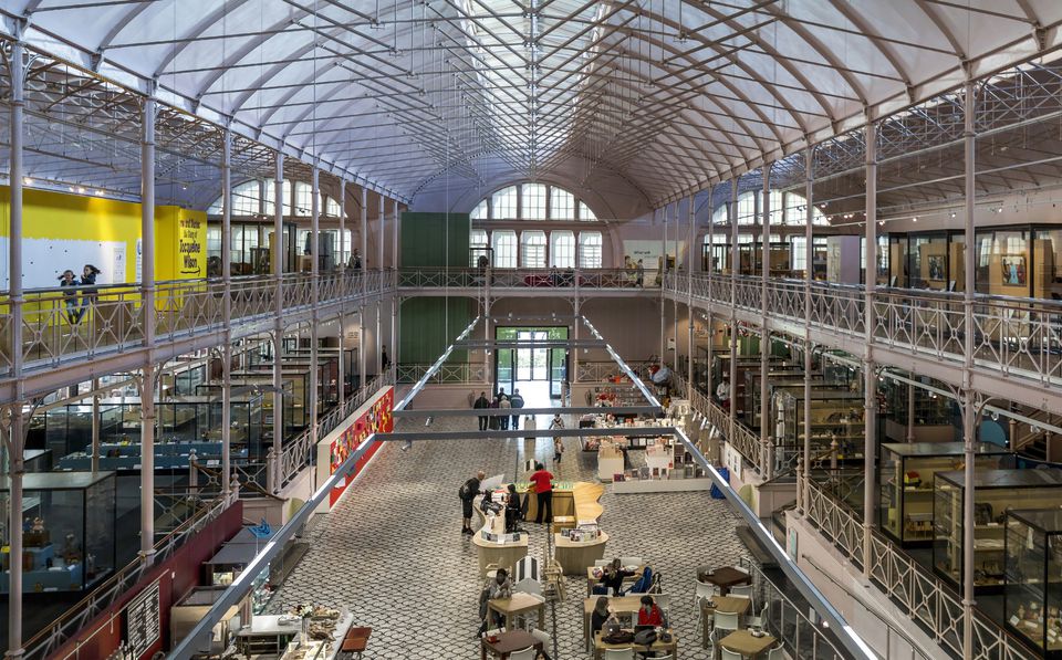
Exhibition Piece Idea #2
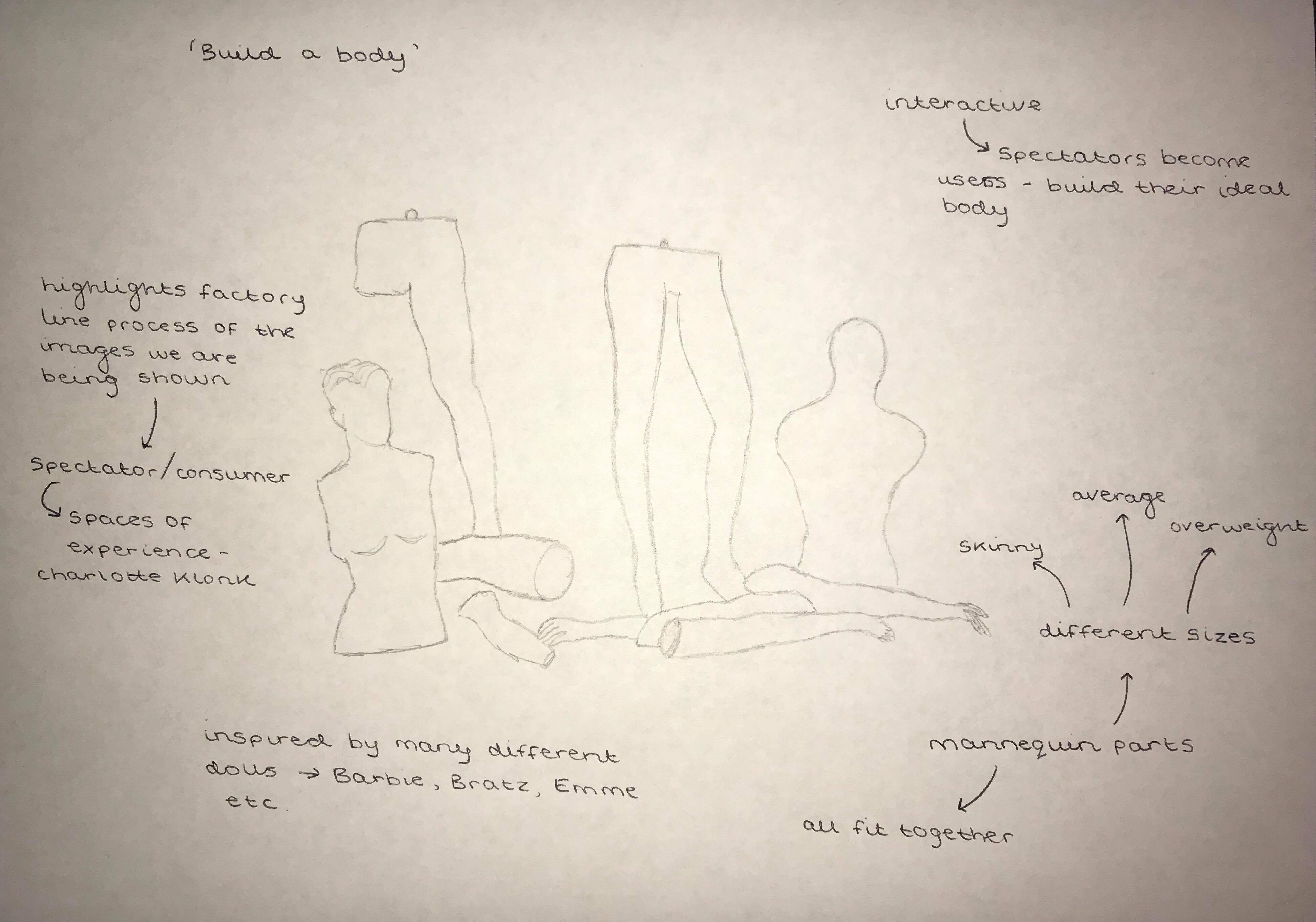
'Build a Body'
The second idea I have for my final piece, is to build mannequin pieces of all different body sizes, in short; skinny, average, and overweight. It links with the idea of consumerism, in the sense that you'll mostly find mannequins in clothing stores, advertising the latest clothes. Instead, with this piece, the spectator becomes the consumer, shopping for their ideal body. The mannequin parts will all fit together, to build the ideal body/figure that the spectator wants for themselve, much like how a child might build their ideal bear at Build a Bear Workshop.
Exhibition Piece Idea #3
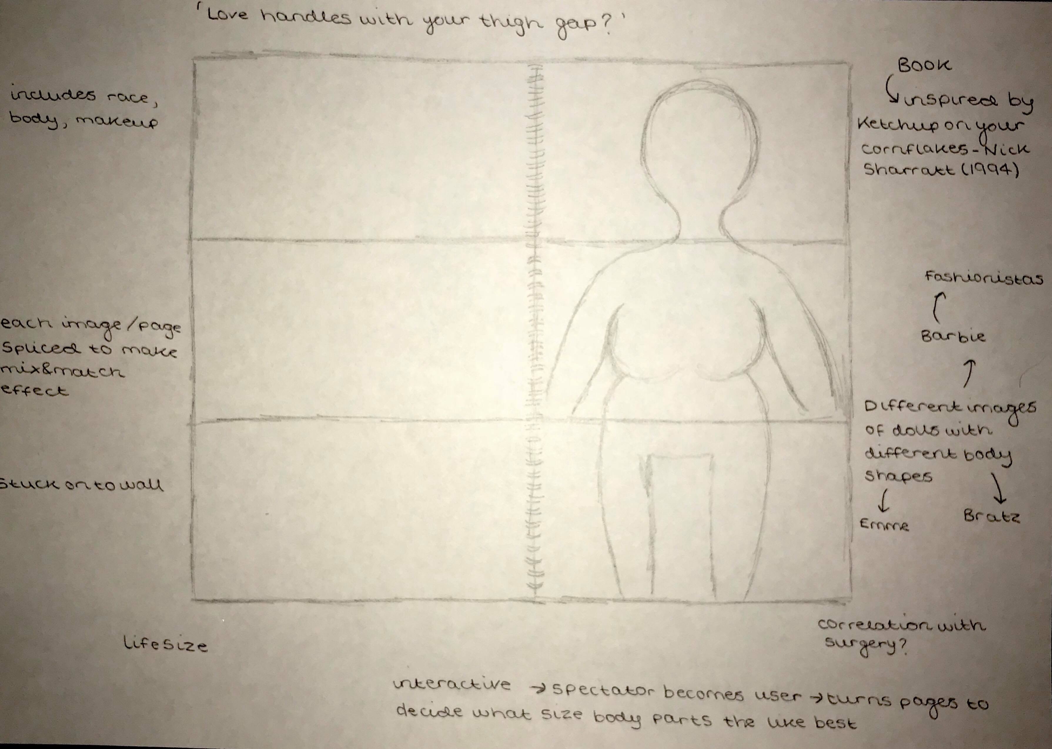
'Love Handles with your Thigh Gap?'
This is titled ‘Love Handles with your Thigh Gap?' Although the title may need some work! It is inspired by the popular children’s book Ketchup on your Cornflakes by Nick Sharratt who wrote it in 1994.
Essentially, the final piece will take the same form of the book, but instead each page will be spliced into three sections; one for the head and shoulders, another for the mid section or torso and the final for the hips and legs. This piece puts an emphasis on measurements and body size in relation to body image, stemming from the countless times the measurements of dolls and their unrealistic standards have been discussed at length. This piece is interactive, making the spectator become the user and, ultimately the consumer, shopping for their ideal figure or body, like a consumer might shop in catalogue. Much like Andy Warhol’s pieces, this piece will subliminally project the idea that the experience had in an art gallery was no more meaningful than that in a supermarket, which is recited in Charlotte Klonk’s Spaces of Experience book (Klonk 2009). It will use dolls that are featured in the archive, but since the museum does not allow for the artefacts to be taken out, I will source my own dolls of the same kinds. The dolls will vary in brands and body types, from a skinny, unobtainable body like that of Barbies, to a more realistic but still odd body like that of Bratz and a larger body size like that of Emme or Barbie fashionistas.
Jellinek. R.D, Myers. T.A, Keller. K.L, 2016 The Impact of Doll Style of Dress and Familiarity on Body Dissatisfaction in 6- to 8-year-old Girls
A more recent study conducted by Jellinek, Myers and Keller, research found that the overall trend of body image in relation to dolls really depends on what dolls children are playing with.
In the first study, they observed 112 girls ages 6 to 8 playing with Barbie and Tracy - with each doll wearing two styles of clothing: bikinis and modest attire. Most of the girls recognized Barbie, and significantly fewer recognized Tracy. They found that the girls who played with Tracy, regardless of what she was wearing, felt better about their bodies, Myers said. The second study, which was also with 112 girls ages 6 to 8, used dolls that were not as familiar to the participants, according to the study. Instead, the experiment used Stardoll from Mattel, for the thinner doll, and Mimi Bobeck from “The Drew Carey” show, for the full-figured doll. The two studies found that “girls tended to desire a body shape more closely aligned to the dolls with which they played.” When they played with the thin dolls, they wanted to be thinner. When they played with the full-figured dolls, the desire for thinness was suppressed. In the second study, with the less-familiar dolls, the style of dress mattered more, the researchers found. Myers stated that “early engagement in body image discussion is particularly important because poor body image is linked to the development of eating disorders.”
Highlights of the study, as taken from the study overview:
Body shape of dolls influenced young girls’ ratings of body dissatisfaction.
Girls who played with thin dolls desired thinner body shapes after playtime.
Playing with full-figured dolls suppressed girls’ desire for thin body shapes.
Alternative Art and Anthropology: Global Encounters edited by Arnd Schneider, ‘Ethnography, ‘pataphysics, copying’ by X. Andrade pp. 189-208
Ethnography - the scientific description of peoples and cultures, with their customs, habits and mutual differences
Pataphysics - the branch of philosophy that deals with an imaginary realm additional to metaphysics
Andrade discusses Full Dollar, a company founded in 2004 that traffics in anthropology and contemporary art. Its name follows the dollarization of Ecuadorian economy in 2000. Andrade is interested in casting an ethnographic look on art scenes and institutions, and the social life of objects, images, and ideas.
In this chapter he talks about his artworks, in the practise of ethnography, community and so on. He states that 'my ethnographic interests became part of a larger, productive and innovative form of "curatorial design"'. The chapter explores the relationship between ethnography in relation to anthropology and art. Andrade discussed the juxtaposition and its effects, and appropriation saying that it was a positive to approach the collections that he had created. He states that the translation of the Full Dollar collection into an entirely different setting, from Ecuador to Los Angeles, opened a new set of questions, methods, negotiations and debates. He points out that 'at the core of this, issues of authorship, power and conflict emerged: between ethnography and art, between art and crafts, between businesses and advertising.' However, he recognises that by broadcasting the process from multiple views, this community could find a relevant reference to discuss ongoing gentrification in the area.
The projects of Full Dollar are forms of trafficking into the art world. Simultaneously, by incorporating different strategies of curatorial design into the rojects mentioned and the fieldwork processes, Andrade's practise echoes that of George Marcus, who said that rethinking anthropological research as design processes would engulf and preserve classic fieldwork. However, it would 'both relativise its functions and blur its beginning and end in conceiving it within the broader contexts and operations that so much research now entails'.
The Impact of Doll Style of Dress and Familiarity on Body Dissatisfaction in 6- to 8-year-old Girls - Jellinek. R.D, Myers. T.A, Keller. K.L, 2016
Highlights from the study:
- Body shape of dolls influenced young girls’ ratings of body dissatisfaction.
- Girls who played with thin dolls desired thinner body shapes after playtime.
- Playing with full-figured dolls suppressed girls’ desire for thin body shapes.
This study concluded that the overall trend in body dissatisfaction really depends on what type of toys children are playing with. The researchers tested the impact of exposure to dolls of different body types and wardrobes on girls’ body dissatisfaction. Girls who played with full-figured dolls showed less body dissatisfaction after doll exposure compared to girls who played with thin dolls. Playing with unrealistically thin dolls may encourage motivation for a thinner shape in young girls.
In the first study, they observed 112 girls ages 6 to 8 playing with Barbie and Tracy, the character Tracy Turnblad from the film Hairspray (Shankman 2007), with each doll wearing two styles of clothing: bikinis and modest clothes. Most of the girls recognised Barbie, and a lot fewer recognised Tracy. They found that the girls who played with Tracy, regardless of what she was wearing, felt better about their bodies. The second study, which was also with 112 girls ages 6 to 8, used dolls that were not as familiar to the participants, according to the study. Instead, the experiment used Stardoll from Mattel, for the thinner doll, and Mimi Bobeck from “The Drew Carey” show, for the full-figured doll.The two studies found that “girls tended to desire a body shape more closely aligned to the dolls with which they played.” When they played with the thin dolls, they wanted to be thinner. When they played with the full-figured dolls, the desire for thinness was suppressed.
In the second study, with the less-familiar dolls, the style of dress mattered more, the researchers found. Playing with full-figured dolls suppressed girls’ desire for thin body shapes.
"We tested the impact of exposure to dolls of different body types and wardrobes on girls’ body dissatisfaction. In Study 1, 112 girls (6 to 8 years old) were randomised to one of four conditions: thin (Barbie™) or full-figured (Tracy™) dolls dressed in a swimsuit or modest clothing. In Study 2, a different cohort of girls (n = 112) was exposed to one of four conditions containing unfamiliar dolls of different body size (thin vs. full-figured) and dress (modest vs. swimsuit). In both studies, girls who played with thin dolls experienced higher body size discrepancies than girls who played with full-figured dolls. Girls who played with full-figured dolls showed less body dissatisfaction after doll exposure compared to girls who played with thin dolls. Playing with unrealistically thin dolls may encourage motivation for a thinner shape in young girls."
FINAL EXHIBITION PROJECT
Having completed the first term of Making and Curating, and the first assignment, being original exhibition piece idea and presentation, it was time to decide whether I would stick with the doll archive, or move to a new idea.
After careful consideration, I decided that the final doll exhibition piece was rather large scale and perhaps impractical to carry out alone. Due to illness, I happened to miss the lecture where everyone discussed their ideas and grouped up to work together on projects. Therefore, the following week, I listened to everyone's new ideas and chose to join the project that I found the most interesting; this group consists of Georgia, Anastasia and Sakuna.
Their idea regards selfies, with the archive being Instagram, combined with personal camera rolls. The project concerns itself with the idea that, while seeing selfies on social media has become a normal thing that everyday consumers think nothing of, the act of taking selfies, especially in public, is something that still sticks out like a sore thumb! To my knowledge the piece aims to highlight how civilians look while taking selfies, simultaneously presenting the final selfie to make viewers aware of the process and the product.
I am looking forward to the creation of our final exhibition piece and I am excited to see the final product!
INITIAL DRAWINGS:
ARTIST STATEMENT DRAFT:
Upon attempting to write our artist statement, we found ourselves frequently getting stuck and often found ourselves at a loss in terms of what we wanted to say. Even after persevering through these mind blanks, we still were not quite sure what we wanted to communicate across to our spectators.
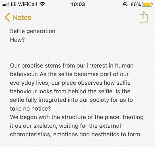
After some discussion and thinking, we managed to figure out our collective interests and intentions and subsequently managed to write our opening paragraph (pictured above). While we know we have a lot more to write, we decided that perhaps it is wise to not force anything and take it into class to get some second openings and guidance. Hopefully we can gain some insight into what others think and this will help us write the rest of the statement.
EDIT: Include relational aesthetics theory (Bourriaud) - the idea that art has a tendency of being created based on or inspired by human relations and their social context.
Upon initial planning, we decided to draw some sketches of what we hope our piece will look like. Essentially, the project will take the form of a book, presenting the images in a portfolio style, where the selfie will sit directly next to the 'behind the selfie' image on a double page spread, directly comparing the process with the product (the process of taking a selfie, and the product being the final selfie).
Somehow, the book will attach to the wall through the back two pages, as can be seen in the diagram, allowing the content pages to almost stick out and turn easily, adding 3D and interactive elements to the piece.
Alternatively to having the selfie sit directly next to the 'behind the selfie' image, we thought about having the behind the selfie image sit literally behind the selfie, on the back of the final selfie image. That way, it might include an element of surprise, not revealing the point of the piece straight away, perhaps making spectators more intrigued, keeping them at our piece for longer.
In terms of the nitty gritty details of the piece, the images will be printed on to A3 photo paper for a more professional high quality look, and the book itself will sit at eye level on the wall, with the wall being white, so as to not distract from the piece.
While we are not yet sure on how to build the structure, we hope to have this figured out within the next two weeks.
While there are not many exhibitions on at the moment regarding selfies or selfie culture, it occurred to me that an exhibition I visited last summer can be used as a reference point for this project; the Selfie to Self Expression exhibition that was held at the Saatchi Gallery from March to May 2017 is a directly related exhibition that has much relevance to our final project. There is, in fact, a post on this blog above regarding the same exhibition.
However, looking at it from this new perspective of our piece and it's meaning, the exhibitions exploration of selfies, from portraiture to modern day photographs and modern technology exhibits how selfies have existed for centuries in many different forms. It highlights the idea that narcissism has been alive in our society for longer than we may initially think. While years ago it may have been impossible to document the process of making or taking selfies, we can understand that looking at or watching the process, even centuries ago, may have been a weird experience that highlights this narcissism and ultimately makes people aware of the way in which they can be perceived. Including work from the likes of Rembrandt to Tracey Emin, the curator, Nigel Hurst, argues that "the selfie is by far the most expansionist form of visual self expression, whether you like it or not...the art world cannot really afford to ignore it." (the Guardian 2017)
(The Guardian, 2017 https://www.theguardian.com/artanddesign/2017/mar/30/selfie-as-art-at-saatchi-gallery-from-rembrandt-to-a-grinning-macaque)
POP UP SHOW // February 21st
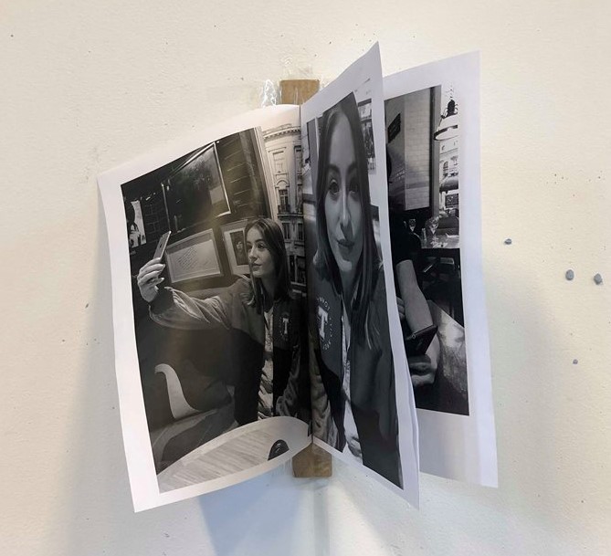
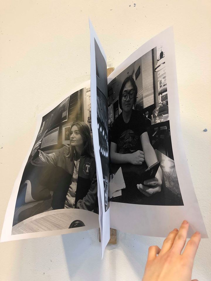
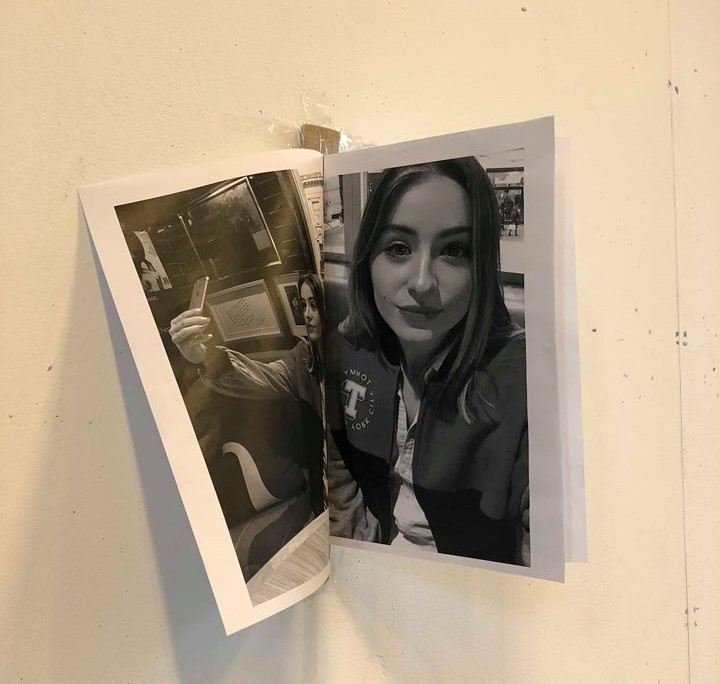
We took part in a pop up show in order to show a draft of our final project, in terms of content, structure and exhibition, in aims to get feedback regarding what works and what areas we need to improve on.
This was our mock up piece which just comprised of images printed on paper, cardboard and tape:
Upon looking and observing our mock up piece in order to critique it, Elena said that it would be better to take pictures of random people in central London that are taking selfies. For instance tourists, who may be taking selfies in front of Big Ben perhaps using a selfie stick. She suggested that our piece become more observational and ethnographic, as opposed to posed and perhaps biased. While we agree that perhaps is should aim to be as impartial as possible, we don't agree with her suggestion of taking photos of random people in public places and displaying them as that has ethical implications and could potentially also take away from the message that we are intending to portray. Elena also highlighted the fact that we are still in need of a title, which we hope to come up with in the next week or so!
Selfie: How the West became self-obsessed - Will Storr
Will Storr’s book regards the idea of the human self’s relationship with itself from many angles. Early on, he stays in a Scottish monastery and decides that spending one’s time this way in the hope of heavenly reward constitutes “a lifetime of self-obsession”.
Storr’s argument begins in the 1960s, with the establishment of the Esalen Institute in California, a site of therapeutic hippy self-discovery founded by those devoted to “humanistic psychology”, which more or less says that people’s hang-ups are caused by not being true to their authentic feelings. Storr visits the institute, liberating himself, expressing that “this was the me I feared the most". “He was the lonely man, the angry man, the weirdo. He was the cunt. And, in that moment, I had a terrible realisation. I was loving being the cunt.”
The problem with the idea of being your authentic self, Storr decides, is that you almost certainly don’t have a single authentic self. And if it is true, as Aristotle reckoned, that you become what you habitually do, then encouraging people to be assholes is simply going to produce a lot of new assholes. That is what Storr reckons happened when promoting “self-esteem” got onto the official political agenda in the 1980s and 90s, both in the US and the UK. More self-esteem was said to be the key to improving educational performance and curing all kinds of social faults. Promoting self-esteem became central to educational policy. But in fact, the only reliable correlation between higher self-esteem and better outcomes is with exam results, and it turns out that high self-esteem follows good exam results, rather than causing them.
The “neoliberal self” - our modern cultural construction of what a person should ideally be: “An extroverted, slim, beautiful, individualistic, optimistic, hard-working, socially aware yet high-self-esteeming global citizen with entrepreneurial guile and a selfie camera.” What’s wrong with this? Well, “If it’s true that we hold within us all the power we need to succeed, then it naturally follows that if we fail then it’s our fault and our fault alone.”
Storr also interviews a young woman who takes selfies all day and posts them to Instagram with captions such as “Hypnotising, mesmerising me”. Her family background conforms to the theory Storr promotes that “parental overpraise” – constantly telling a child he or she is wonderfully special and so forth – predicts higher scores on tests for narcissism. This leads him to wonder whether all the various developments he has documented have led to the creation of an entire “generation of narcissists”.

ARTIST STATEMENT SECOND DRAFT:
Our practise stems from our interest in human behaviour; as the selfie becomes a new constant in our everyday lives, our piece observes how selfie behaviour looks, from behind the selfie. It asks how far selfies reflect reality. The selfie regards the self, and to regard the self often means to think selfishly, giving way to narcissistic behaviour. As society becomes increasingly consumerist, we become increasingly aware of ourselves, from appearance to behaviour. The prevalence of portraiture throughout centuries combined with the advancements in technology have made us accustomed to seeing the selfie, especially on social media. Modern reality however, challenges the idea of selfies being part of the norm, and often enforces the idea that the act of taking a selfie, is odd.
Our piece, Behind the Selfie is an experimental standalone artwork, asking the viewer to consider whether the selfie is really that normal, and if it reflects reality. Presented as a portfolio, presenting the subjects in a catalogue format, this piece observes, presents, and attempts to make the viewer observe the very nature of selfies. Using photography, it asks the spectator to compare the final product with its production process; how people choose to present themselves, and how they are actually seen. The use of a camera in this piece was essential to reflect the medium in which selfies are taken. In coordination with angles, the different pictures reveal different things about the different people featured in the piece, providing a mix of representations, just as a selfie would, depending on how the subject wishes to present themselves.
In the current state of modern society, the infamous selfie is hard to avoid. Behind the Selfie is an attempt to showcase selfie behaviour, critiquing the very nature of the selfie and the perceptions that selfies create. It is an examination of the narcissism that modern consumer culture has created.
Miss Fotojapon - Juan Pablo Echeverri
http://juanpabloecheverri.com/miss-fotojapon/
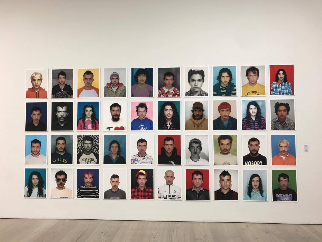
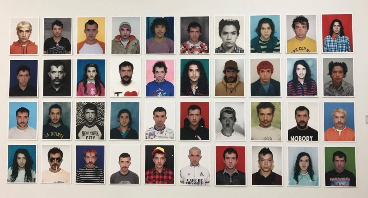
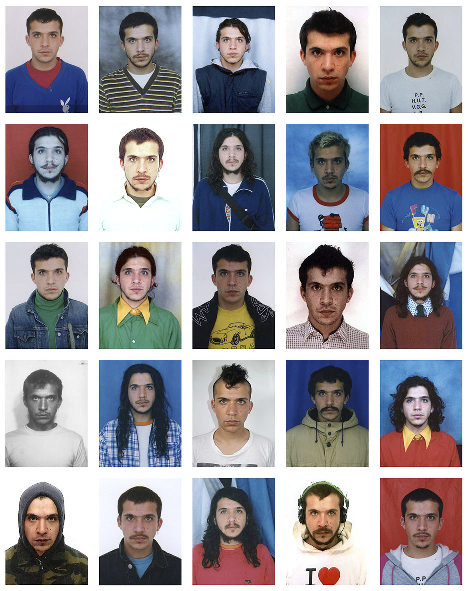
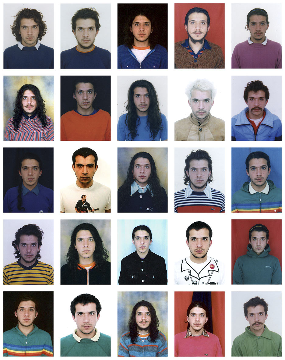
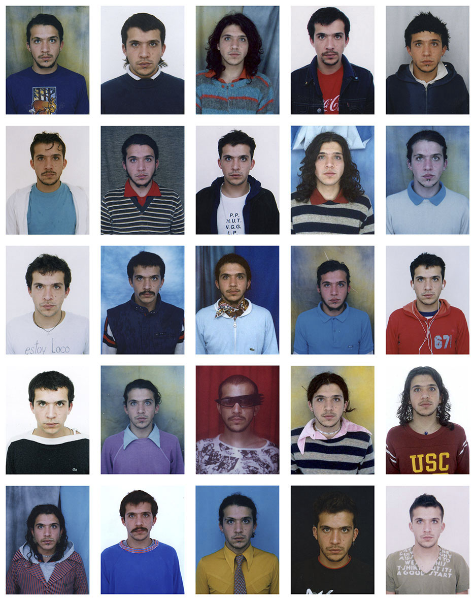
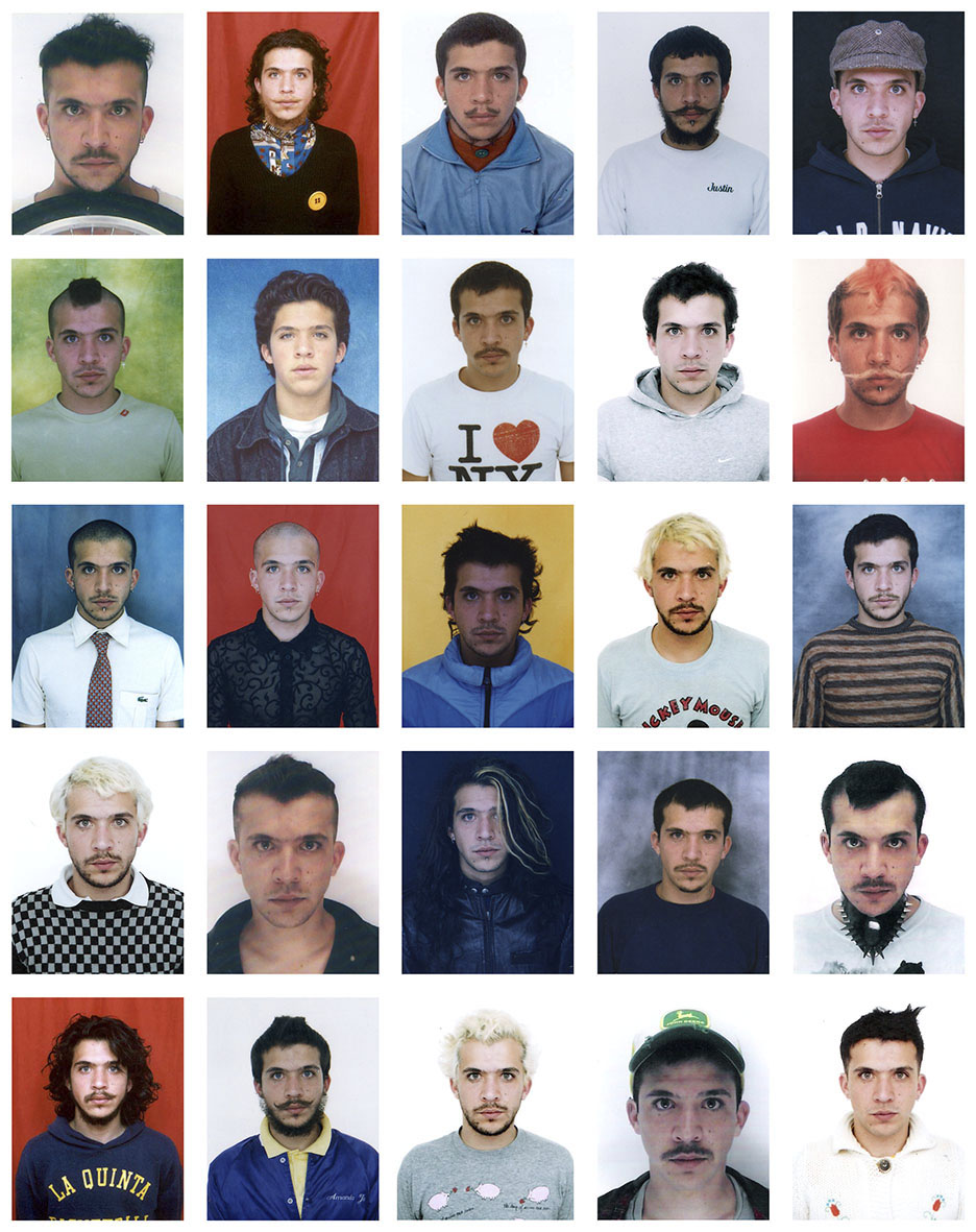
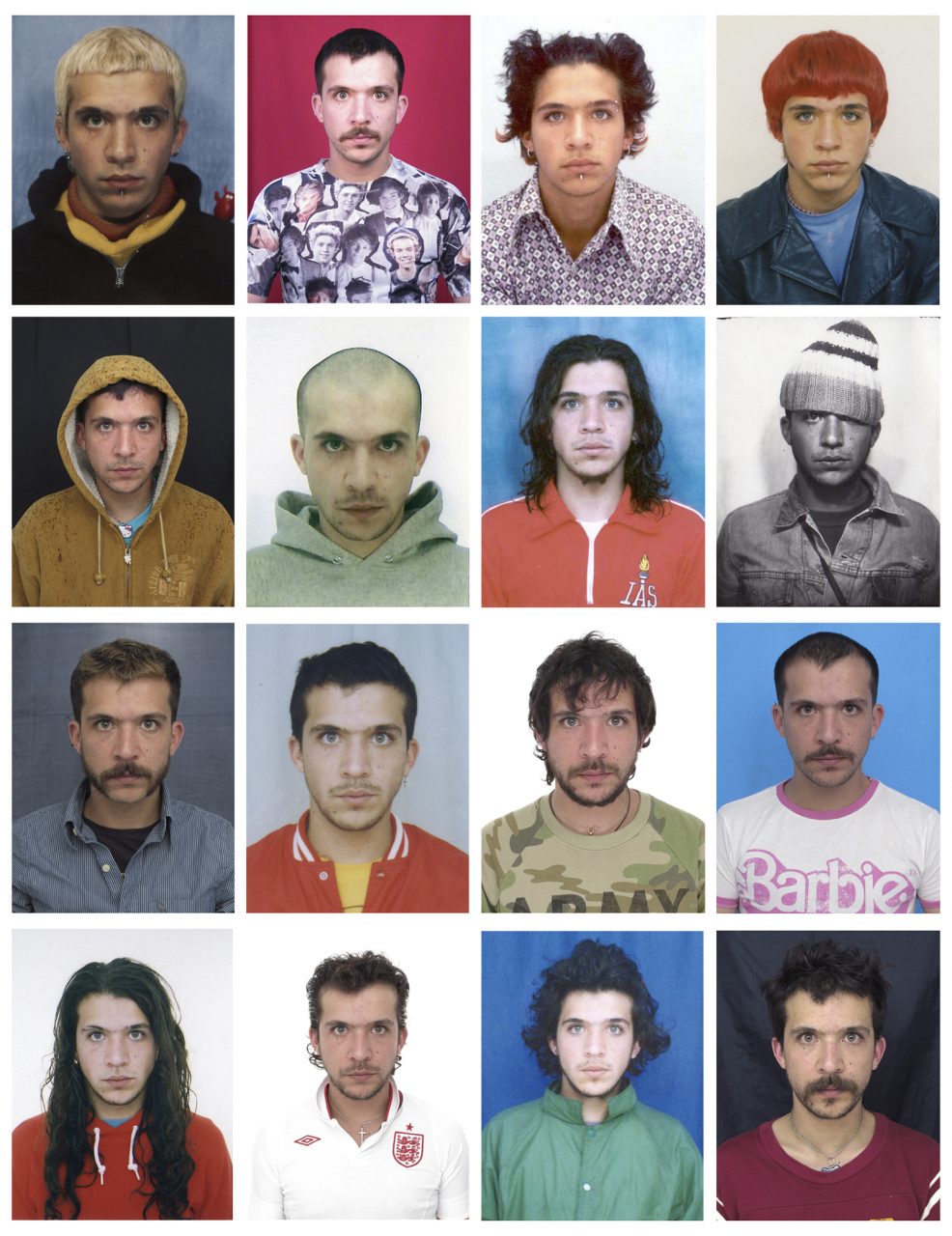
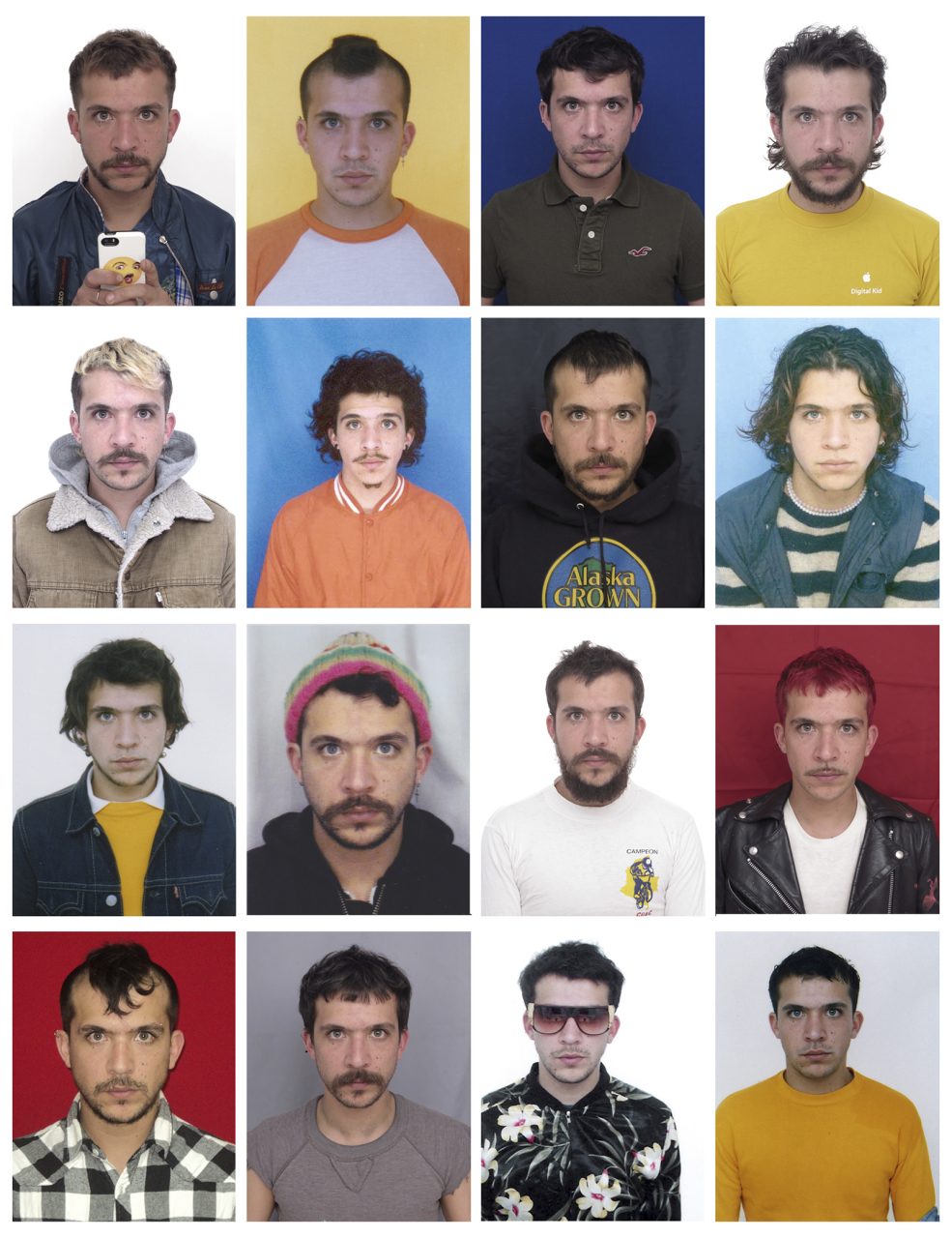
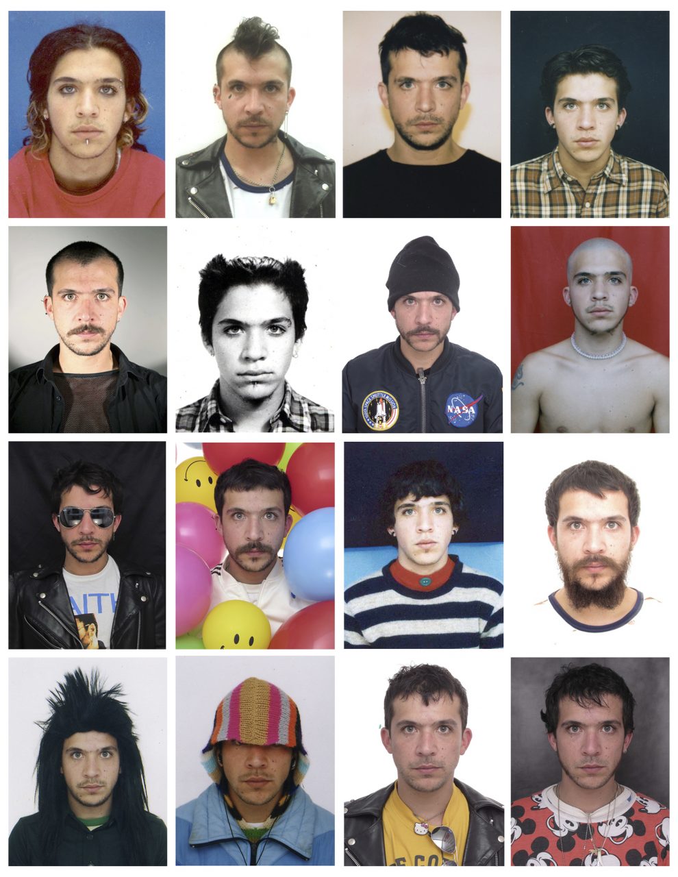
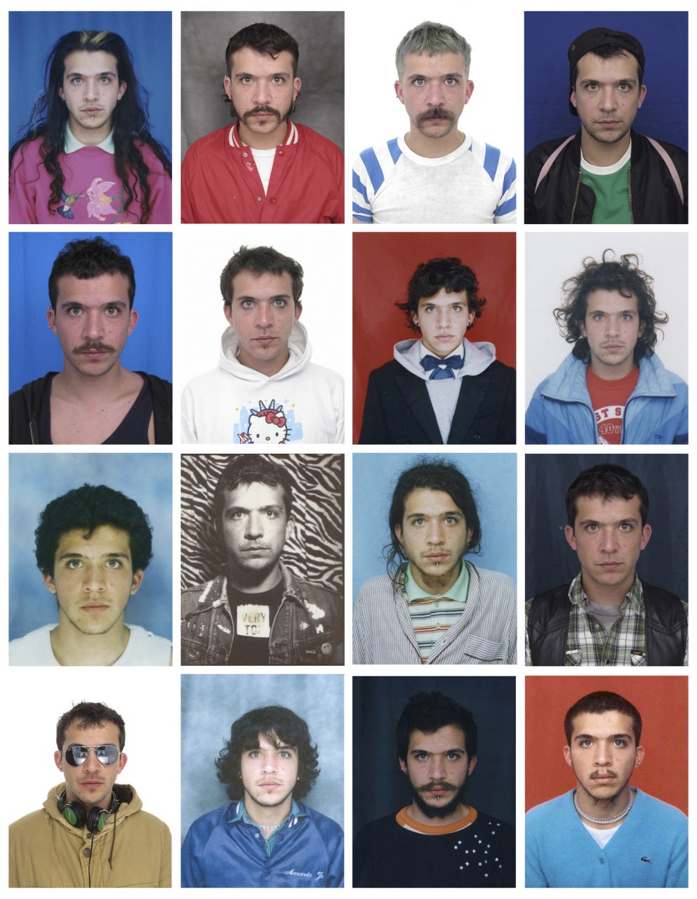
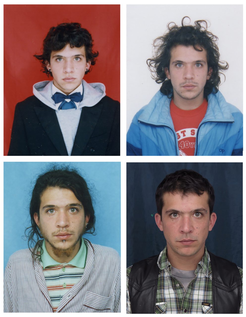
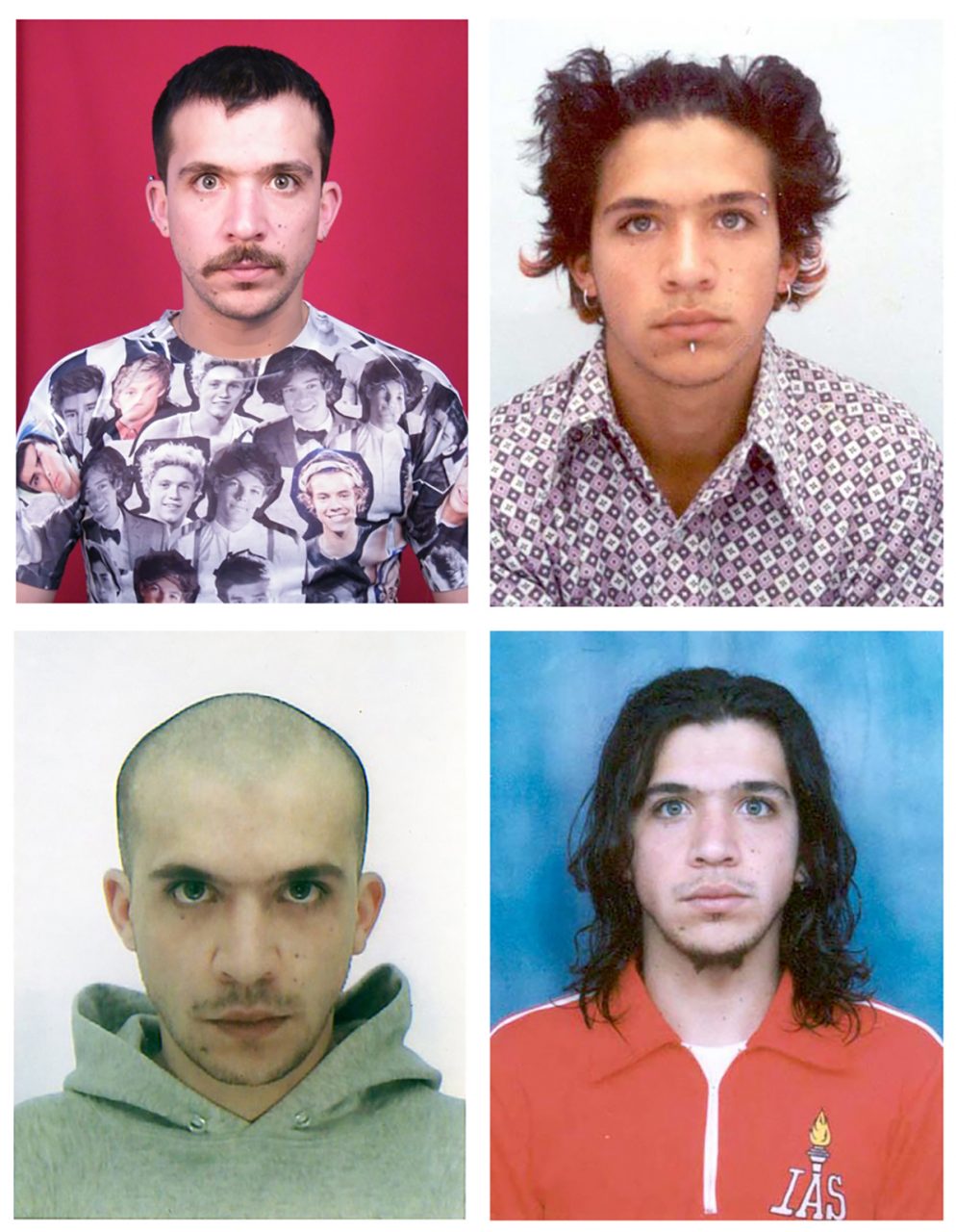
Juan Pablo Echeverri was featured at the Saatchi Gallery exhibition 'Selfie to Self-Expression' back in March-May 2017 and caught my eye through his piece 'miss fotojapon', pictured above.
Echeverri is currently featured at the Head On Photo Festival in Australia (May 5th - May 20th) for his portraiture work. Writing about 'miss fotojapon', Echeverri explains that "miss fotojapon is a series that started as part of a written diary around 1995. I kept on passing by a photo booth near my house and taking pictures every time I walked by. I used to put them in my diary, which started demanding more photos as time passed and I carried on changing my appearance. Beards, piercings, glasses, hats, new haircuts, were all perfect excuses to carry on making these photographs, and taking them became a great excuse to keep changing my appearance as well; it was a vicious cycle.
As time passed, I realised I was going almost on a daily basis, so I decided to do it daily on the 1st of June of 2000. For 17 years, I have been confronting the passing of time from inside photo booths. This work has always been the starting point and backbone of my work, it can also be used as a timeline from which all my other works emerge."
miss fotojapon particularly intrigues me because of the manipulation of documentation that Echeverri employs through his ever changing appearance. It amazes me how clearly he portrays the idea that anyone can make themselves be perceived as anything they wish to be perceived as, especially through photos. When there is no knowledge of a persons personality, it is very easy to judge through appearance and I believe that Echeverri demonstrates this very well. From my point of view, in these photos I see a hippie, a punk, a skinhead and a student amongst many other personas that are all actually the same man.
In relation to selfies and our final piece, the same idea could be applied in terms of people portraying what they want to portray in order to be seen in their desired light. Everything is about presentation and perception.


EXHIBITION SPACE DRAWING:
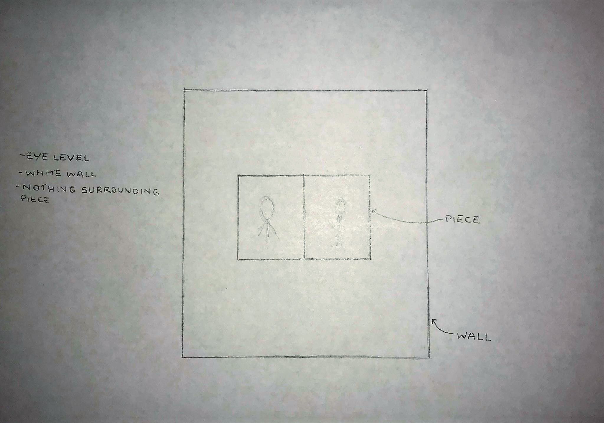
This is our exhibition space drawing. While we don't yet know all the wall measurements in order to detail the technicalities, this is essentially how we want our piece to look in the space. It will sit at eye level to create an easier and seamless viewing experience, on a white wall so as to not distract from the images, with nothing surrounding the piece apart from perhaps the piece title and artist names.
We also still are not sure how to build the book structure for the piece but we plan to visit the workshop at university and hopefully get some useful advice that will lead us in the right direction.
It is difficult to plan the space entirely due to the lack of knowledge regarding how big the walls are and how much space we actually have, but hopefully as time progresses, we will have these details sorted out and things will become clearer.
STRUCTURE TALKS:
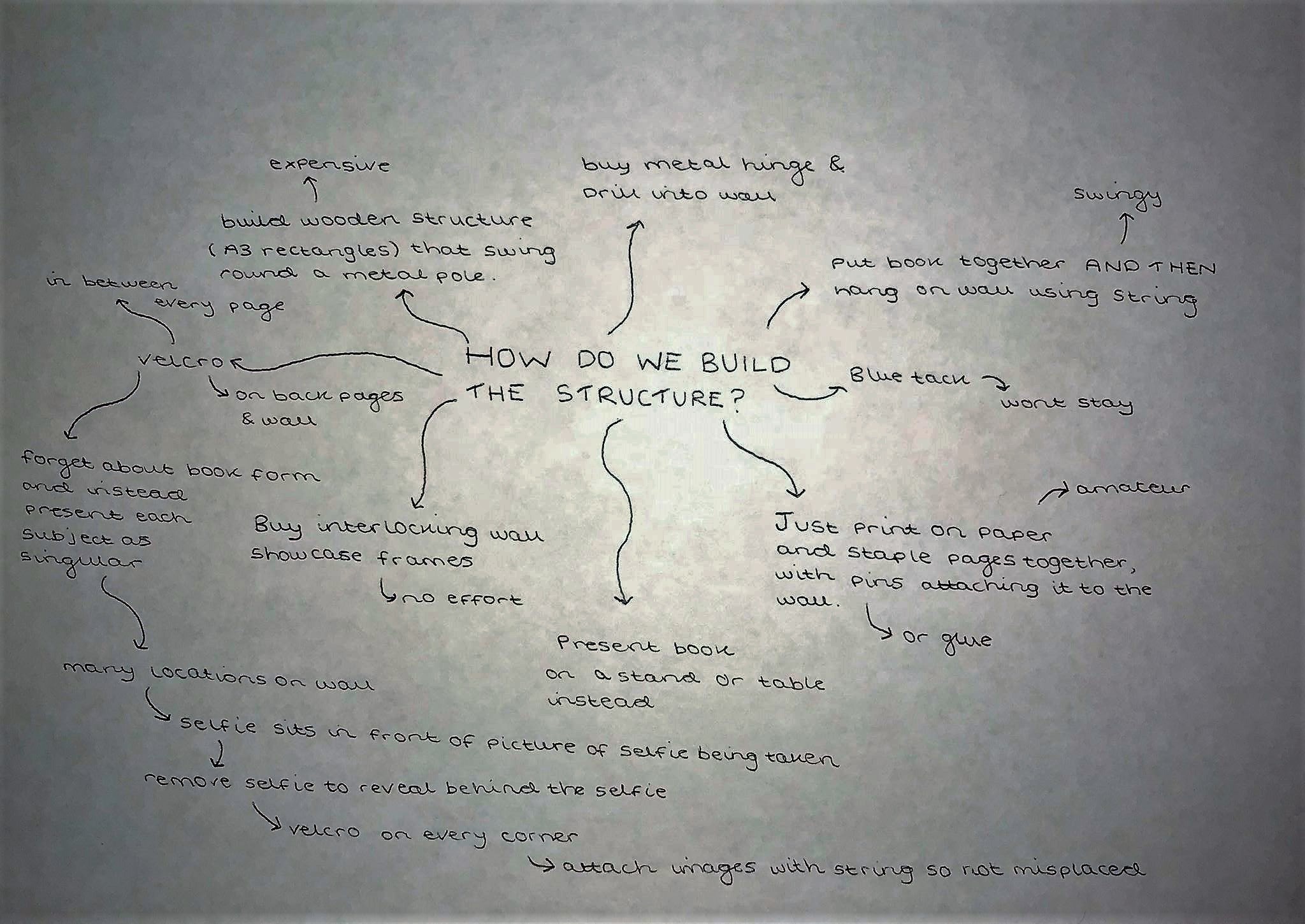
Seeing as we still are not sure on how to build the structure of our piece, we decided to sit down and map out various possible ways in doing so, illustrated above. It did not, however, seem to prove as potentially as easy as we thought! While we came up with many possible methods of building, we ended up coming up with a whole new structure, explained by the 'velcro' branch. This somewhat changes our piece and the means by which spectators view and understand it, but we believe that it may prove to make the piece better and actually gain more interest and interaction from spectators; by using velcro, we will attach the selfie image on top of the behind the selfie image, meaning that spectators will have to lift up the selfie to see the process by which it was taken. This still enables the direct comparison of process and product, but we believe this method is more innovative and differentiated.
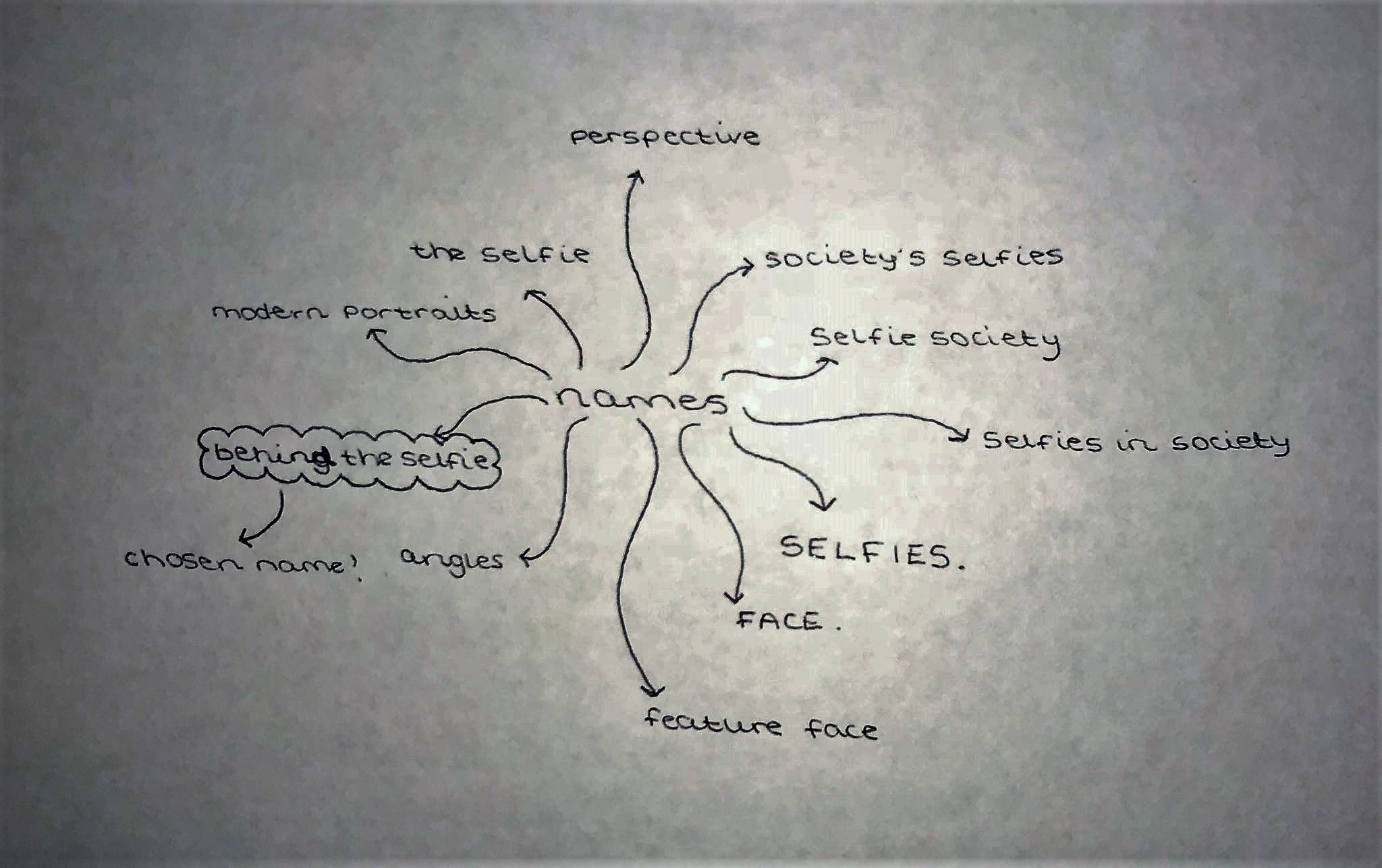
NAMES:
I seem to find that mindmaps really help me to process thoughts and plan tasks, which is why I suggested drawing one up to conjure up a name for our piece. We knew we definitely wanted the title to include the word selfie, but we were not sure on how we would present the word selfie. Our suggestions are exhibited above but we collectively decided on the title 'Behind the Selfie'. Not only does our new structure literally present content behind the selfie, but we have been referring to the selfie taking process pictures as 'behind the selfie images'! It also plays on the phrase 'behind the scenes', which is essentially what we are presenting through our piece. I also believe that where our piece may possibly lack an obvious point and spectators may be confused as to what they are looking at and supposed to be taking in, the title reveals all they need to know in order to understand.
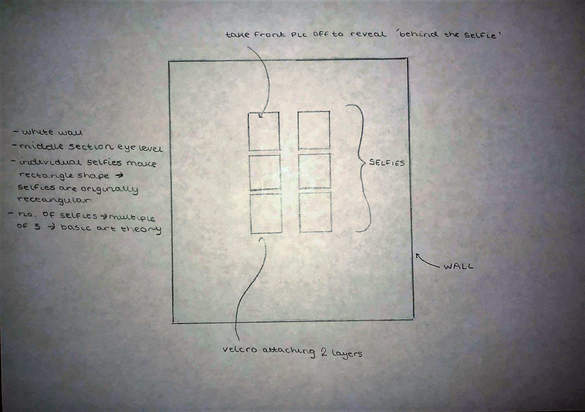
NEW STRUCTURE DRAWING:
With our new idea of using velcro to attach the images together and this meaning that our structure has now changed, we decided to draw out our new piece to get a real idea of how we want it to look.
We will now lay the images out flat directly on the wall, with the selfie taking process image sitting behind the the actual selfie, attached with velcro. There will be six sets of images/selfies, meaning six people will be needed for the content. The reason for there being only six sets of images is that we still have no knowledge of exhibition wall size and it is a multiple of three, which is a basic art theory that I learned in school. It also creates the shape of a rectangle, reflecting the shape of a typical modern mobile phone with is typically always used to take selfies. The piece will still aim to be eye level, with the middle tier of pictures sitting directly at eye level and the upper and lower tiers sitting only a maximum of three centimetres above and below the middle tier. This structure, I believe, is an improvement from the original idea because it sets out the images clearly and openly, creating a more sophisticated look, like that of what you might see on social media, where selfies heavily populate the platforms.
How Selfies Became a Global Phenomenon - Elizabeth Day - https://www.theguardian.com/technology/2013/jul/14/how-selfies-became-a-global-phenomenon
'The smartphone self-portrait or 'selfie' has established itself a form of self-expression.'
"The selfie is revolutionising how we gather autobiographical information about ourselves and our friends" - Dr Mariann Hardey
"It's about continuously rewriting yourself. It's an extension of our natural construction of self. It's about presenting yourself in the best way … [similar to] when women put on makeup or men who bodybuild to look a certain way: it's an aspect of performance that's about knowing yourself and being vulnerable."
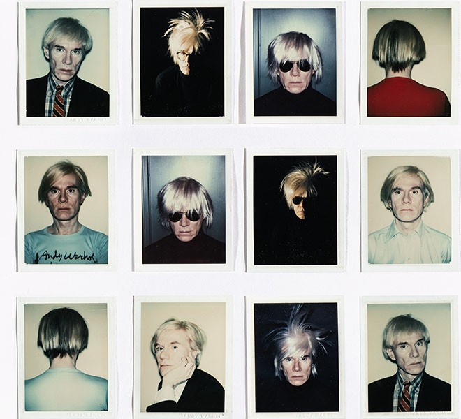
'Although photographic self-portraits have been around since 1839, when daguerreotype pioneer Robert Cornelius took a picture of himself outside his family's store in Philadelphia (whether he had the help of an assistant is not known), it was not until the invention of the compact digital camera that the selfie boomed in popularity. There was some experimentation with the selfie in the 1970s – most notably by Andy Warhol – when the Polaroid camera came of age and freed amateur photographers from the tyranny of the darkroom. But film was expensive and it wasn't until the advent of digital that photographs became truly instantaneous.'
'To some, the selfie has become the ultimate symbol of the narcissistic age. Its instantaneous nature encourages superficiality – or so the argument goes. One of the possible side-effects has been that we care more than ever before about how we appear and, as a consequence, social acceptance comes only when the outside world accepts the way we look, rather than endorsing the work we do or the way we behave off-camera.'
'Titlow argued that selfie users "are seeking some kind of approval from their peers and the larger community, which thanks to the internet is now effectively infinite".'
'The popularity of the selfie is, says Mariann Hardey, "an extension of how we live and learn about each other" and a way of imparting necessary information about who we are.'
'You can use digital technology to manipulate your own image as much as you like. But the truth about selfies is that once they are online, you can never control how other people see you.'
ANDY WARHOL & SELFIES
It would seem Warhol understood that the new self-portrait, which was no longer created by paint and brush and now utilised technology, was a crucial form of art that embraced popular culture — something that was flourishing in America in the 60’s. He saw beauty in the instantaneous document of a person.
Warhol believed that anyone could have their moment in the spotlight. It therefore suited him that these photo booths were found in public, unglamorous places, such as railway stations and shopping malls. Warhol predicted that: “In the future, everyone will be world-famous for 15 minutes.” The growing influence of social media, such as Instagram, would seem to prove that he was very right, in the sense that people can now become famous simply with the distribution of self image.
#selfie - Instagram archive
The hashtag '#selfie' has amassed a total of 343,949,267 posts on Instagram so far. This is just one example that gives an indication as to how far the selfie has gone in its popularity. Seeing as Instagram is essentially our archive, I figured I wanted to see just how many people employ the use of this hashtag, but of course this is not truly representative of selfie popularity as a whole due to not everyone hashtagging 'selfie' and Instagram is just one platform on which selfies are posted. It is interesting to note however, that the hashtag doesnt just consist of pictures of peoples faces, it would seem that people may use the hashtag for any type of image, eg. as seen above, a picture of nails.

ARTIST STATEMENT DRAFT 3:
Our practise stems from our interest in human behaviour; as the selfie becomes a new constant in our everyday lives, our piece observes how selfie behaviour looks, from behind the selfie. It asks how far selfies reflect reality. The selfie regards the self, and to regard the self often means to think selfishly, giving way to narcissistic behaviour. As society becomes increasingly consumerist, we become increasingly aware of ourselves, from appearance to behaviour. The prevalence of portraiture throughout centuries combined with the advancements in technology have made us accustomed to seeing the selfie, especially on social media. Modern reality however, challenges the idea of selfies being part of the norm, and often enforces the idea that the act of taking a selfie, is odd.
Our piece, Behind the Selfie is an experimental standalone artwork, asking the viewer to consider whether the selfie is really that normal, and if it reflects reality. Presented as a layers, this piece observes, presents, and attempts to make the viewer observe the very nature of selfies. Using photography, it asks the spectator to compare the final product with its production process; how people choose to present themselves, and how they are actually seen. The use of a camera in this piece was essential to reflect the medium in which selfies are taken. In coordination with angles, the different pictures reveal different things about the different people featured in the piece, providing a mix of representations, just as a selfie would, depending on how the subject wishes to present themselves.
Our inspirations take the form of Andy Warhol and his fascination with documenting the self, as well as a recent Saatchi Gallery exhibition: Selfie to Self-Expression, which exhibits the work of Rembrandt to Echeverri.
In the current state of modern society, the infamous selfie is hard to avoid. Behind the Selfie is an attempt to showcase selfie behaviour, critiquing the very nature of the selfie and the perceptions that selfies create. It is an examination of the narcissism that modern consumer culture has created.
INSTALLATION!
It is the final week of term, with this assignment being the last of mine to be submitted. With the exhibition construction beginning to take place at university, and all of our pictures ready to be printed and put together to create our piece, we came to university at the beginning of the week in order to try and get a head-start. However, due to a lack of communication between course reps/show organisers and students, we ended up wasting a lot of our time this week.
TUESDAY:
Despite some teething problems with the printing of the images, we managed to get them printed at a print shop on A3 sized 300gsm paper for a little cost of £11.68.
As the images were taken using phone cameras on selfie mode for selfies and normal mode for selfie taking process pictures, the dimensions of each type of photo was different and it was only upon trimming the images that we realised that all the images happened to be different sizes. Nonetheless, we cut all the selfies down to the same size and all the behind shots to the same size, with the selfies of course being narrower than the behind images. We informed our course rep of the changes we had made to our piece structure, and this made things rather difficult for both us and the organisers because we did not know that all changes had to be confirmed with them way in advance and they had only assigned us a space big enough for our original piece. Despite this however, they managed to find us a new wall that we could have which seemed perfect for our new structure as it was the same shape and our piece would look good and well fitted there. Having okayed everything with the organisers and going home due to the walls still being painted, we then got an email stating that actually, our piece will have to stay the original size because we could only use up an A1 sized landscape space on the wall we were given. The reasoning for this as I understood is that all work featured in the exhibition has to fit within certain borders on the walls. I am not quite sure why but I understand that perhaps this is due to wanting to keep within style and theme of the exhibition as a whole. We are now not quite sure what to do.
WEDNESDAY:
My group returned to university today without me as I had work commitments but it turned out that they still could not make any progress on the piece due to the show organisers still painting the walls.
THURSDAY:
Returning once again to university, we arrived at 11am and were eager to start installing our piece, thinking it would be a rather quick and easy task. However, our wall space happened to be in the vicinity of a tutorial, where we could not enter the space until the class were finished at 2pm. A little annoyed, we went to the library and made some progress on our blogs. Returning at 2pm, more ready than ever to install our piece, we were then told that we were not allowed to install ourselves and we would have to wait for the organisers to come round to do it for us. We didn't really understand why such an easy task had to be made so difficult but we waited anyway and figured we would try an map out our piece on the wall ready for installation. However, no matter what we tried, the piece would not fit within the space we were given and we were forced to revert our piece back to the original structure idea.
We bought an A3 portfolio and started sticking our photos to the sheets of paper that came with it, so as to position our images where we wanted and make sure they do not move.
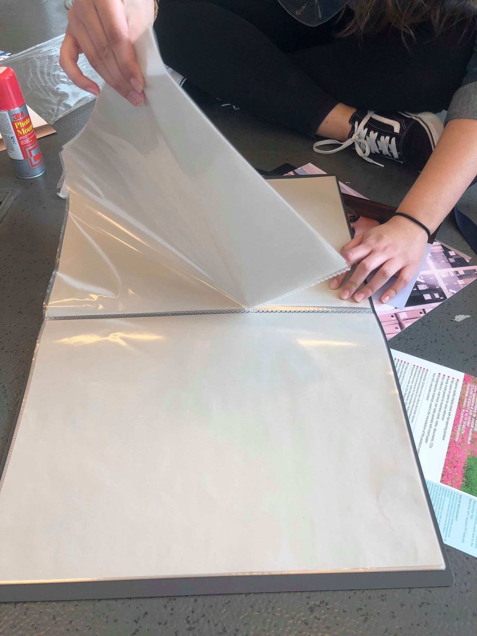
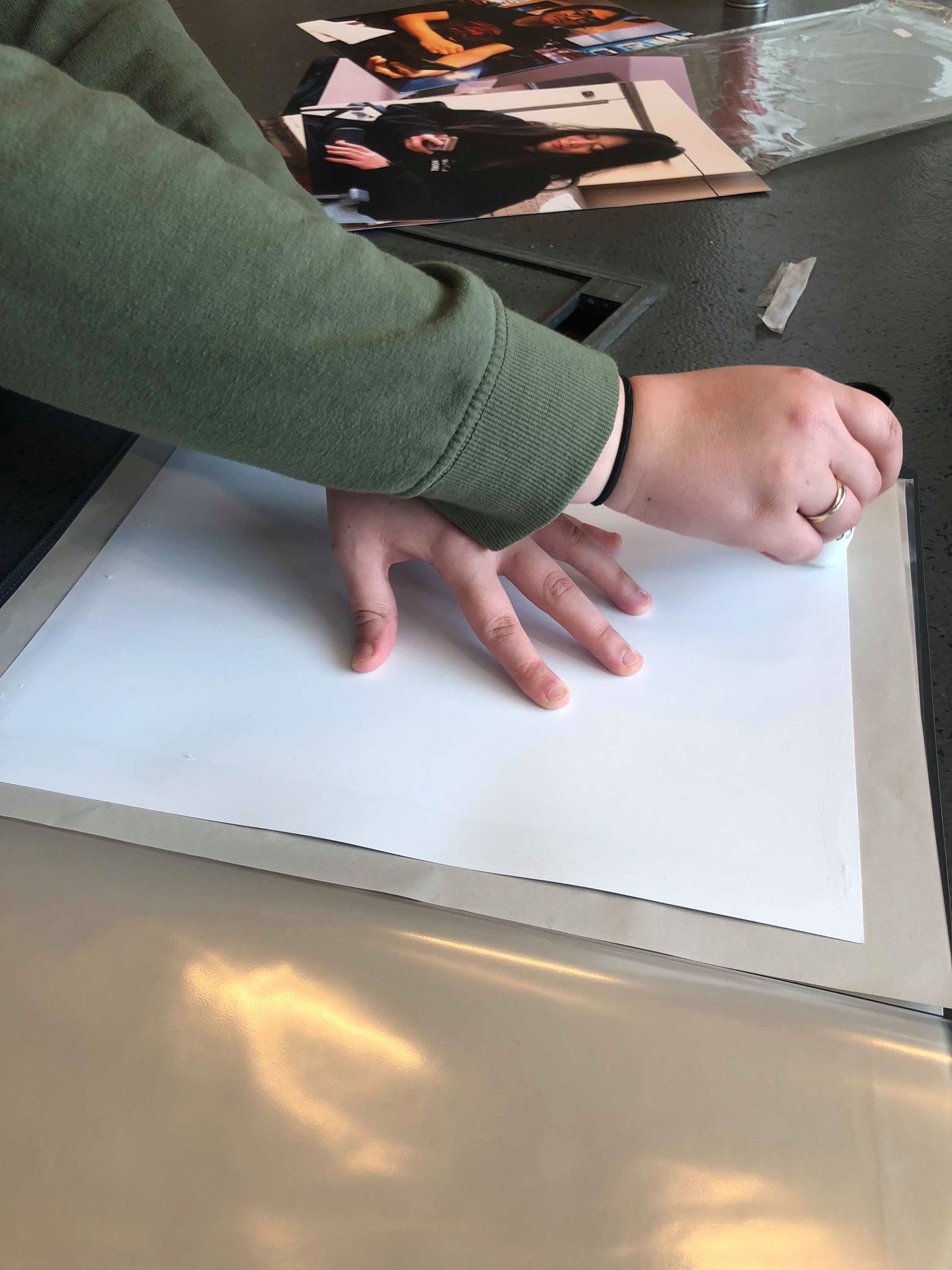
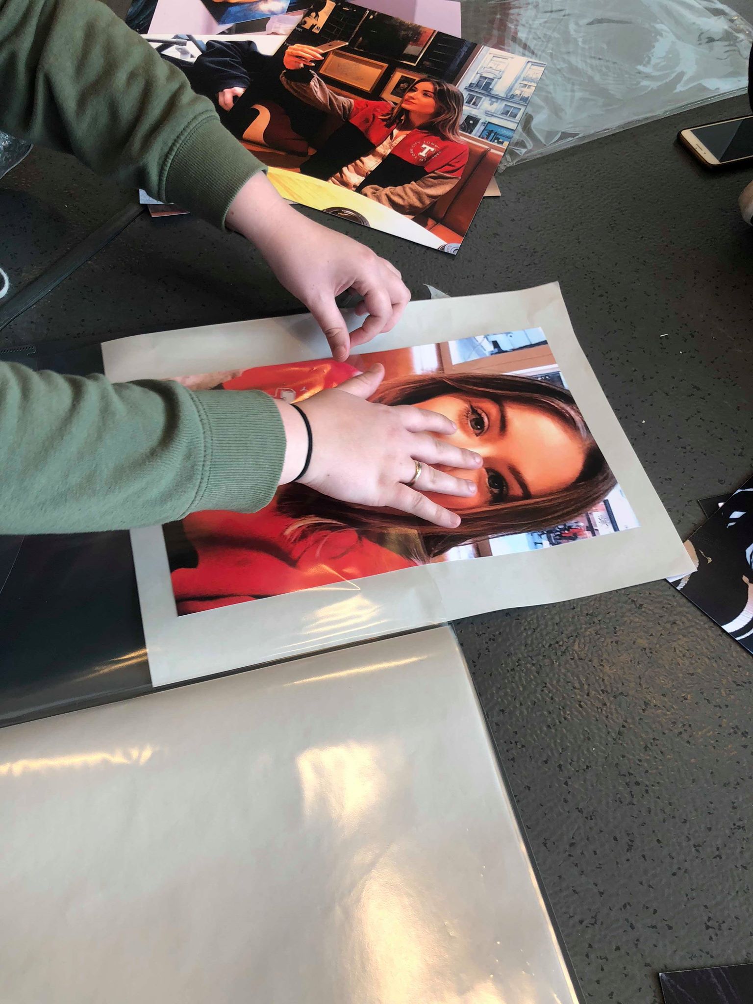
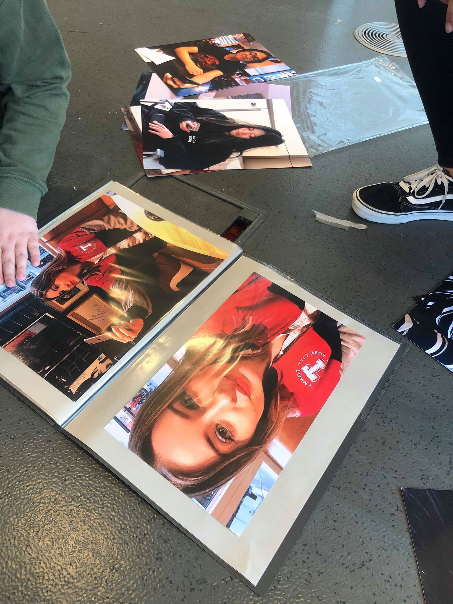
INSTALLATION CONTINUED
Having put all our portfolio structure together, all that was left to do was install the piece on to the wall. After waiting three hours for someone to come and put it up, we decided that we could not wait any longer as we all had other commitments to get to, so I asked one of the organisers and thankfully she came to us straight away and got someone to help her hang our work up. While I am disappointed that our work had to revert back to the original idea, I am very relieved to have it finished and see the final piece in its final form. In all honesty, I do believe that it could have been better but I am still proud of the work that we produced.
FINAL PIECE
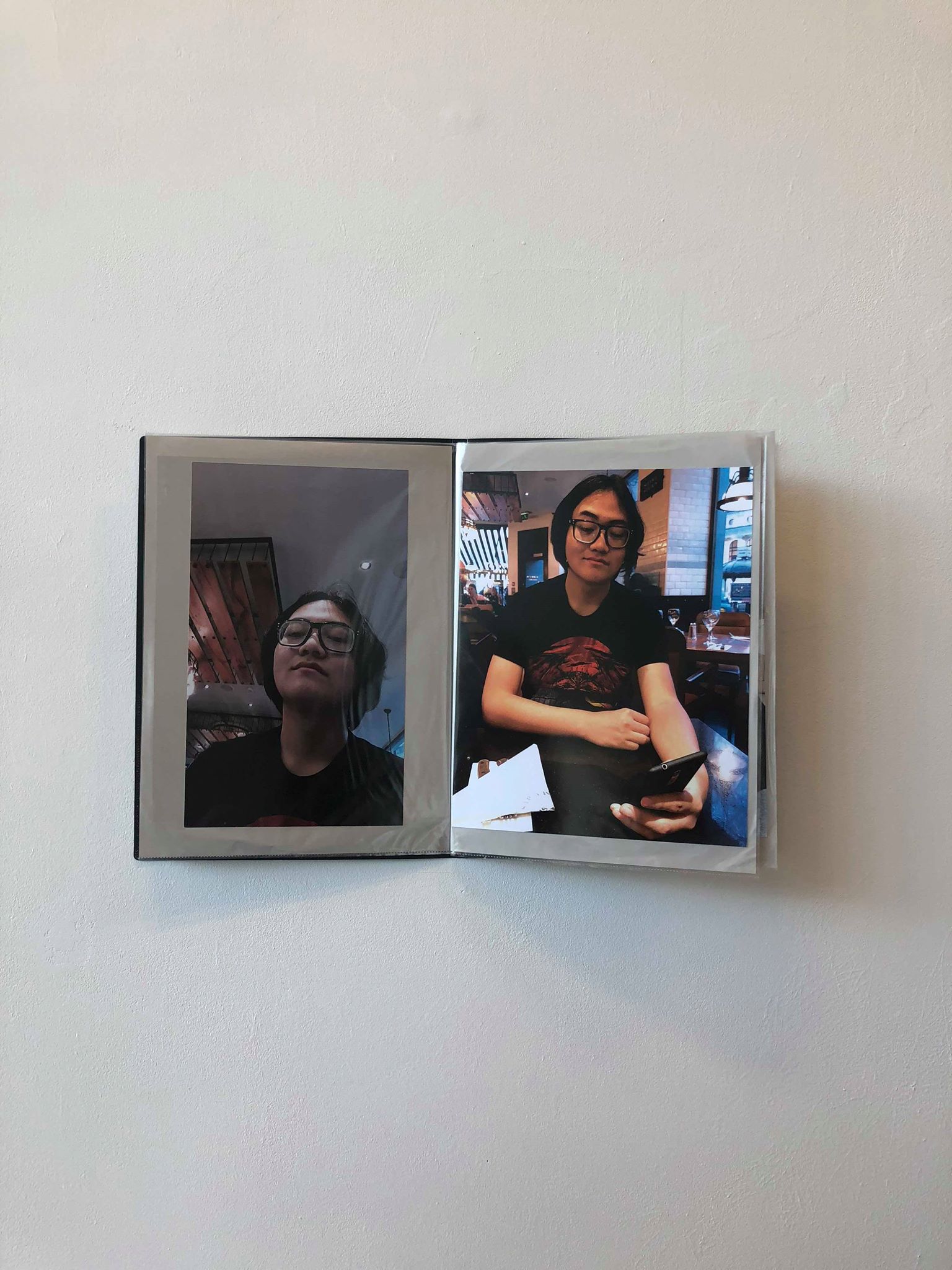
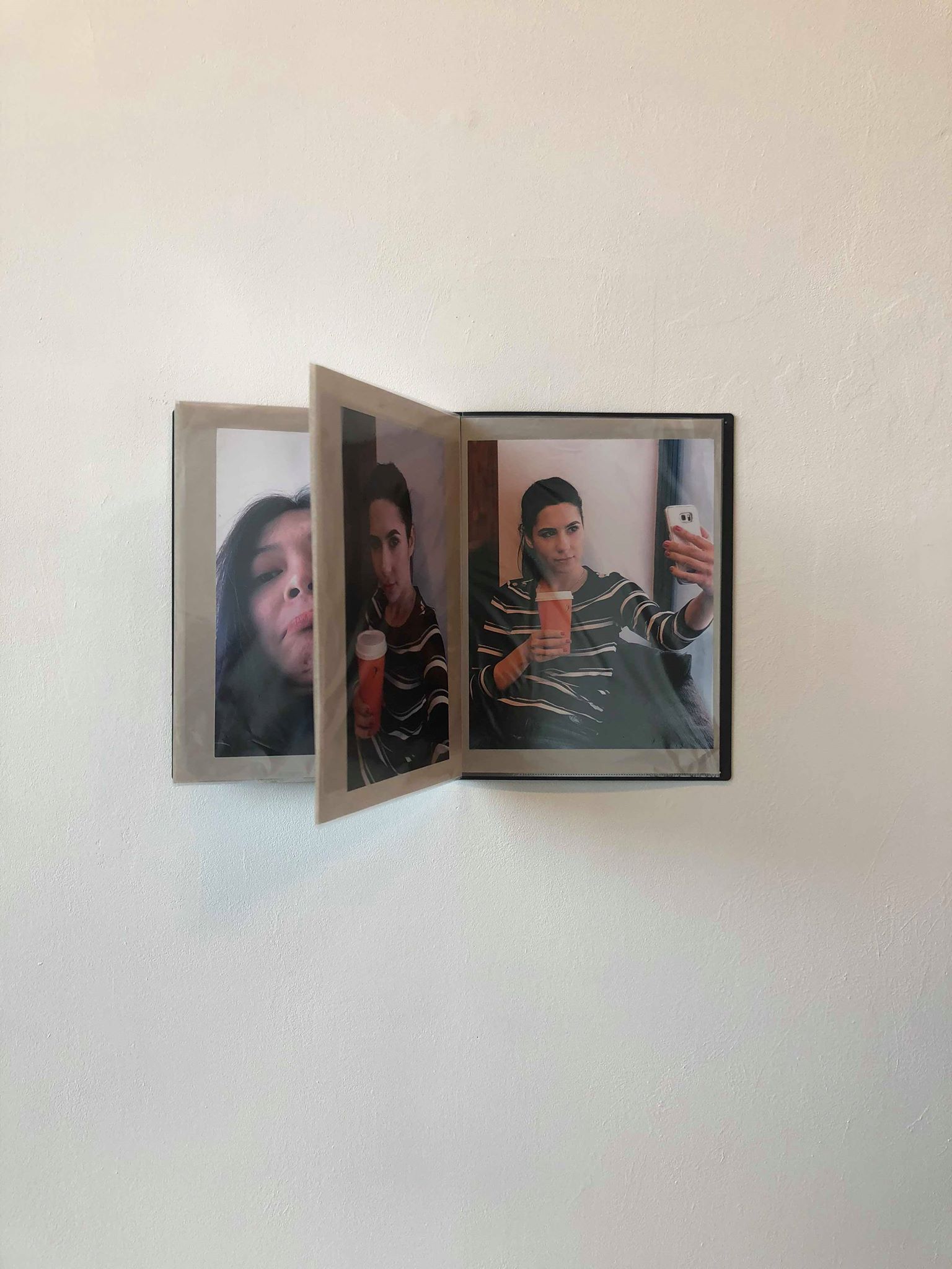
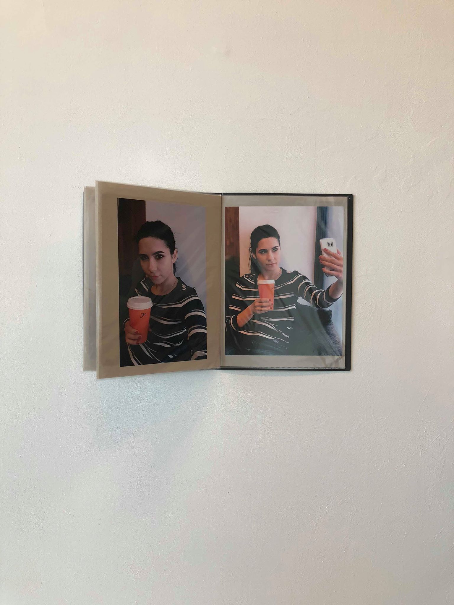
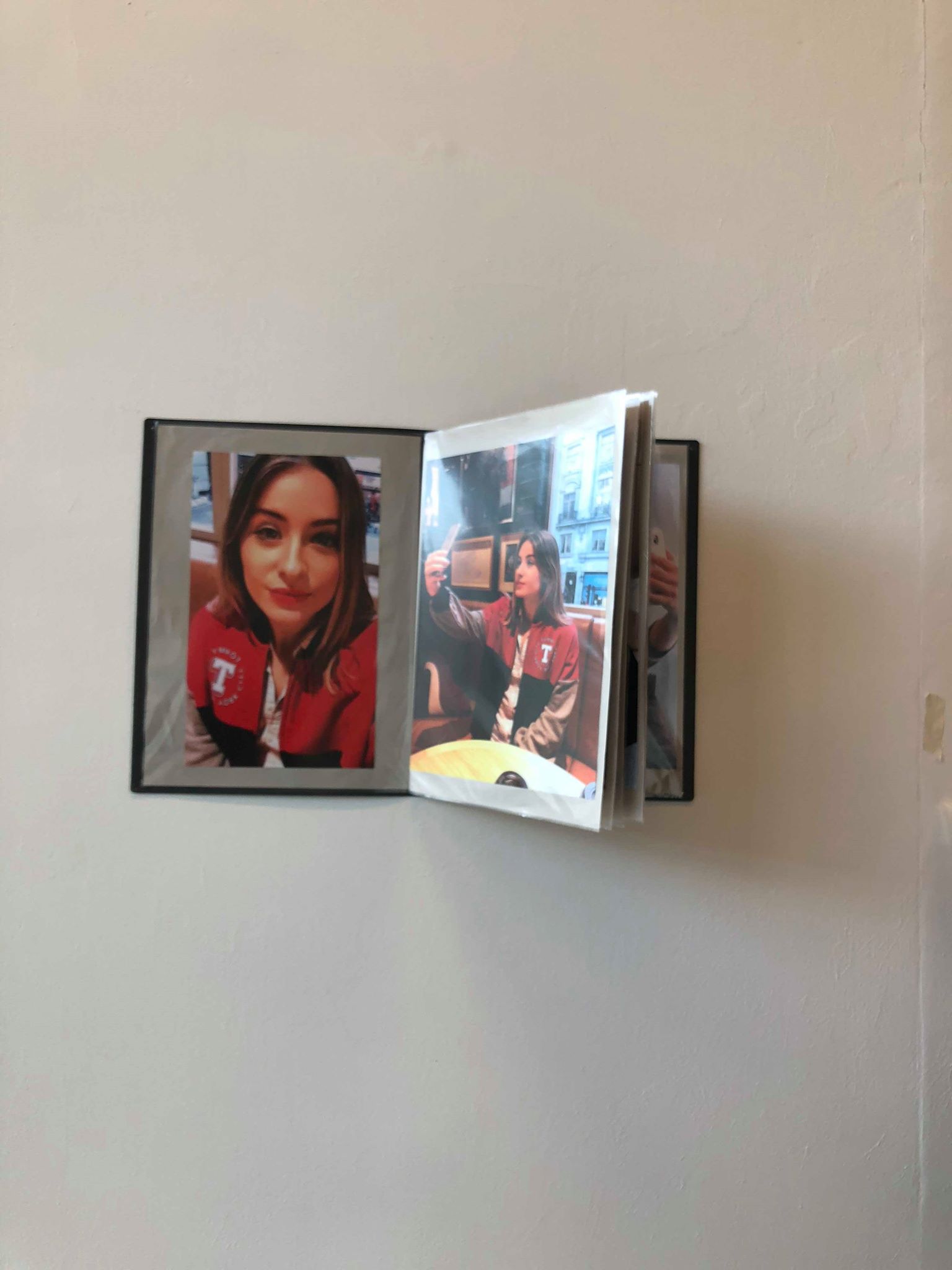
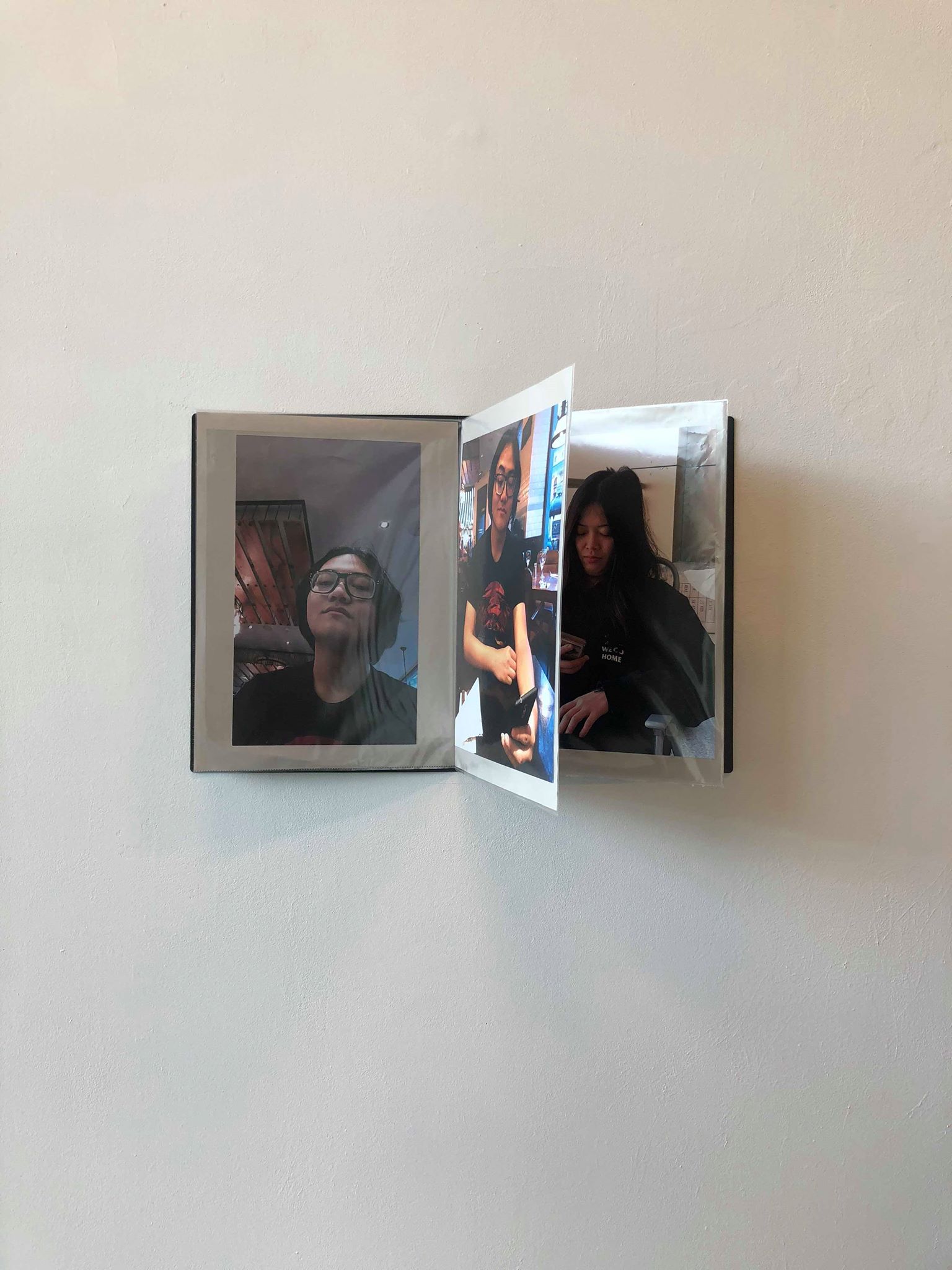
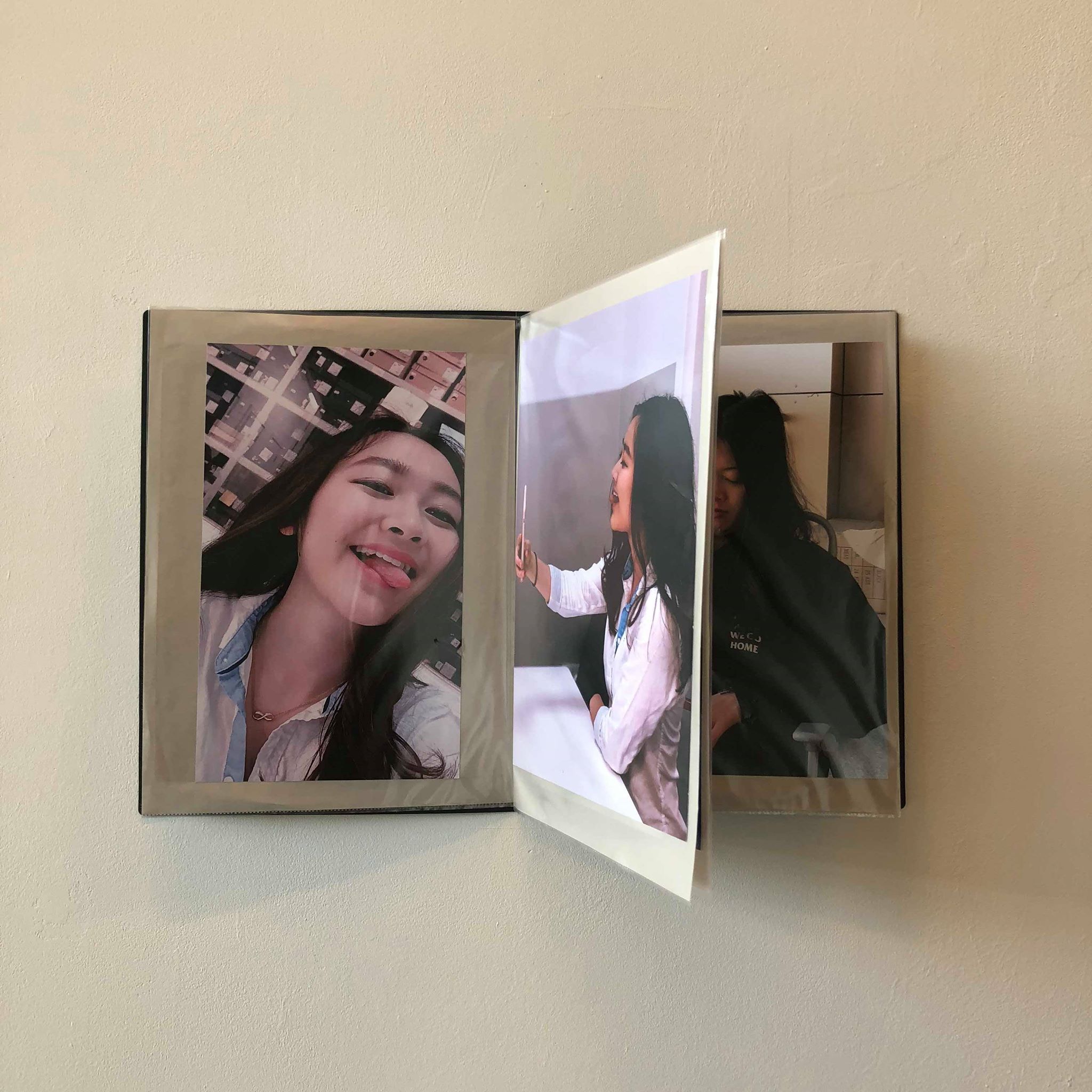
FINAL ARTIST STATEMENT:
Our practise stems from our interest in human behaviour; as the selfie becomes a new constant in our everyday lives, our piece observes how selfie behaviour looks, from behind the selfie. It asks how far selfies reflect reality. The selfie regards the self, and to regard the self often means to think selfishly, giving way to narcissistic behaviour. As society becomes increasingly consumerist, we become increasingly aware of ourselves, from appearance to behaviour. The prevalence of portraiture throughout centuries combined with the advancements in technology have made us accustomed to seeing the selfie, especially on social media. Modern reality however, challenges the idea of selfies being part of the norm, and often enforces the idea that the act of taking a selfie, is odd.
Our piece, Behind the Selfie is an experimental standalone artwork, asking the viewer to consider whether the selfie is really that normal, and if it reflects reality. Presented as a portfolio, presenting the subjects in a catalogue format, this piece observes, presents, and attempts to make the viewer observe the very nature of selfies. Using photography, it asks the spectator to compare the final product with its production process; how people choose to present themselves, and how they are actually seen. The use of a phone camera in this piece was essential to reflect the medium in which selfies are taken. In coordination with angles, the different pictures reveal different things about the different people featured in the piece, providing a mix of representations, just as a selfie would, depending on how the subject wishes to present themselves. Behind the Selfie was conducted on a global scale, featuring a large spectrum of people all over a broad demographic in attempts to be more representative and account for the fact that, no matter your age, gender, class, ethnicity, everyone takes selfies.
Our inspirations take the form of Andy Warhol and his fascination with documenting the self, as well as a recent Saatchi Gallery exhibition: Selfie to Self-Expression, which exhibits the work of Rembrandt to Echeverri.
In the current state of modern society, the infamous selfie is hard to avoid. Behind the Selfie is an attempt to showcase selfie behaviour, critiquing the very nature of the selfie and the perceptions that selfies create. It is an examination of the narcissism that modern consumer culture has created.
ARTWORK DESCRIPTION:
Presented in a 29.7x42.0cm plastic portfolio, photography was employed to produce selfies and images broadcasting behind the selfie, an element we often do not get to witness. The 300gsm paper images sit on 20gsm beige paper in individual plastic wallets side by side and back to back, directly comparing the final products of self-presentation with the process of creating said self-presentation.
Inspired by the likes of Andy Warhol, for his self-portraits, and Juan Pablo Echeverri, particularly for his piece ‘miss fotojapon’, Behind the Selfie documents the self, as the self intends to document themselves. This art piece is led by the subjects featured in the piece, with us artists following their lead for the directions in which this piece explored. Through angles, facial expressions, outfits and backdrop, one creates a certain perception of themselves, how they intend to be perceived. With no influence over the way in which the subjects are presented, through this piece, we ask the viewer to question whether selfies reflect reality.
REFLECTION:
While creating pieces of art is a task that I am very much used to carrying out, the exhibition element of this project is something entirely new to me, and this is where I feel I learnt the most throughout this course; although I may find it relatively easy to conceive an idea for a piece of art, and although creation methods may also come relatively easily to me, the relationship that our piece had to have and maintain with the exhibition itself proved to be fairly troublesome and I feel that I struggled with coming to terms with the fact that every aspect of our work was not in our hands. Throughout this process, I learnt new communication skills that I perhaps did not know prior to this, and I also learnt that sometimes, it is imperative to just let things run their course before you can do anything about it; In the final week before the exhibition, it proved almost impossible to plan when the necessary tasks were to be completed due to a lack of sufficient communication between show organisers and students, which led to a large amount of wasted time, and also the reversion of our piece structure back to the original portfolio plan. However, with very limited time, we had to buy the portfolio which I was not in favour of because I do not feel that this really adds to our piece. Instead, I feel that it brings our piece down. Nonetheless, I feel that the groupwork aspect of the whole project process helped solidify bonds and ultimately strengthened our piece; we each worked to our strengths and I believe it really helped me to work to the best of my ability and give my all in terms of what qualities I had to offer, which happened to be more on the creative side of the piece, and also the writing elements of the assessment as a whole.
If I were to do something like this again, I would definitely make sure to have frequent communication with organisers and reps in order to ensure thorough planning and limit surprises and unknowns. I would also make sure to leave enough time to handle sudden changes and plan out resolutions to problems effectively without reducing the quality of work.
Despite the troubles faced, I thoroughly enjoyed this experience and I hope to experience it again!